@function torem($px){
@return calc($px / 16);
}
// a clamping function used for fluid values
@function fluid($fmin, $fmax, $vmin, $vmax){
$fminr: torem($fmin);
$fmaxr: torem($fmax);
$vminr: torem($vmin);
$vmaxr: torem($vmax);
$v: calc(100 * ($fmaxr - $fminr) / ($vmaxr - $vminr));
$r: calc( (($vminr * $fmaxr) - ($vmaxr * $fminr)) / ($vminr - $vmaxr) );
@return clamp(#{$fminr}rem, #{$v}vw + #{$r}rem, #{$fmaxr}rem);
}
$desk-max: 2600;
$desktop-upper: 1440;
$desktop-lower: 1080;
$tablet: 600;
$mobile: 300;
$mobile-open-width:70vw;
.navigation{
z-index:1000;
display:flex;
justify-content:space-between;
padding-top:16px;
position:absolute;
}
.nav-links{
position:fixed;
top:0;
right:0;
padding-top:16px;
margin:0;
display:flex;
align-items:end;
justify-content:end;
gap:2px;
z-index:1000;
width:fit-content;
}
.nav-link{
background:rgba(0,0,0,0.65);
position:relative;
border-radius:calc(var(--radius) / 2);
padding:4px 8px;
line-height:1;
font-size:#{torem(12)}rem;
letter-spacing:#{torem(.25)}rem;
transition:background 200ms cubic-bezier(0.3,0,0,1), color 200ms cubic-bezier(0.3,0,0,1), padding 200ms cubic-bezier(0.3,0,0,1);;
&:hover{
background:rgba(255,255,255,1);
color:var(--black);
}
}
.contact-link{
background:rgba(255,255,255,1);
color:var(--black);
position:relative;
display:flex;
align-items:center;
overflow:hidden;
&:before{
content:url('');
width:#{torem(4)}rem;
height:#{torem(4)}rem;
border-radius:1rem;
background-color:var(--red);
position:absolute;
left:-5px;
transition:left 200ms cubic-bezier(0.3,0,0,1);
}
&:hover{
padding-left:11px;
padding-right:5px;
&:before{
left:4px;
}
}
}
.burger{
display:none;
.w-embed{
display:flex;
}
@media (max-width:#{$desktop-lower}px){
display:flex;
}
top: 0;
position: relative;
align-items: center;
justify-content: center;
z-index: 100;
border: 1px solid var(--white);
width: 32px;
height: 32px;
border-radius: 8px;
}
#top, #center, #bottom{
transition: transform 300ms cubic-bezier(0.4,0,0,1);
}
.burger.open{
#top{
transform: rotateZ(45deg) translate(3px, 0px);
}
#center{
transform: scale(0);
}
#bottom{
transform: rotateZ(-45deg) translate(-5px, -2px);
}
}
.burger.open ~ .nav-links_clip{
width:$mobile-open-width;
height:100vh;
}
.hamb{
@media (max-width:#{$desktop-lower}px){
display:flex;
}
}
.nav-links_clip{
@media (max-width:#{$desktop-lower}px){
position:fixed;
height:100vh;
width:0vw;
right:0px;
top:0px;
overflow:hidden;
transition:width 300ms cubic-bezier(0.4,0,0,1);
}
}
.nav-links_wrap{
display:flex;
gap:2px;
transition: transform 300ms cubic-bezier(0.4,0,0,1);
@media (max-width: #{$desktop-lower}px){
flex-direction: column;
position: absolute;
width:$mobile-open-width;
top:0;
padding:16px;
padding-top:80px;
right:0;
background: rgba(0,0,0,.45);
backdrop-filter:blur(12px);
height:100vh;
z-index:1000;
gap: fluid(8, 12, $tablet, $mobile);
.nav-link{
font-size: fluid(14, 16, $tablet, $mobile);
}
}
}
@use 'sass:math';
@function torem($px){
@return calc($px / 16);
}
html,body { padding:0; margin:0;}
// a clamping function used for fluid values
@function fluid($fmin, $fmax, $vmin, $vmax){
$fminr: torem($fmin);
$fmaxr: torem($fmax);
$vminr: torem($vmin);
$vmaxr: torem($vmax);
$v: calc(100 * ($fmaxr - $fminr) / ($vmaxr - $vminr));
$r: calc( (($vminr * $fmaxr) - ($vmaxr * $fminr)) / ($vminr - $vmaxr) );
@return clamp(#{$fminr}rem, #{$v}vw + #{$r}rem, #{$fmaxr}rem);
}
$desk-max: 2600;
$desktop-upper: 1440;
$desktop-lower: 1080;
$tablet: 600;
$mobile: 300;
section, nav{
width:100%;
display: grid;
padding-left: fluid(48, 64, $desktop-lower, $desktop-upper);
padding-right: fluid(48, 64, $desktop-lower, $desktop-upper);
position:relative;
}
.grid-padding-left{
padding-left: fluid(48, 64, $desktop-lower, $desktop-upper);
}
.grid-padding-right{
padding-right: fluid(48, 64, $desktop-lower, $desktop-upper);
}
.grid-padding{
padding-left: fluid(32, 48, $desktop-lower, $desktop-upper);
padding-right: fluid(32, 48, $desktop-lower, $desktop-upper);
}
@media (max-width:#{$tablet}px){
.grid-padding-left{
padding-left: fluid(20, 24, $mobile, $tablet);
}
.grid-padding-right{
padding-right: fluid(20, 24, $mobile, $tablet);
}
.grid-padding{
padding-left: fluid(20, 24, $mobile, $tablet);
padding-right: fluid(20, 24, $mobile, $tablet);
}
}
@media (max-width:#{$desktop-lower}px){
.grid-padding-left{
padding-left: 24px
}
.grid-padding-right{
padding-right: 24px;
}
.grid-padding{
padding-left: fluid(20, 24, $tablet, $desktop-lower);
padding-right: fluid(20, 24, $tablet, $desktop-lower);
}
}
//!------GRID DEFINITIONS------
//------
//grid is desktop first. mobile specific styling is defined with 'm_' and tablet with 't_'
//desktop
@media (min-width:#{($desktop-lower + 1)}px){
section, footer, nav{
width:100%;
padding-left:fluid(48, 64, $desktop-lower, $desktop-upper);
padding-right:fluid(48, 64, $desktop-lower, $desktop-upper);
display: grid;
gap: fluid(32, 48, $desktop-lower, $desktop-upper);
grid-template-columns: repeat(12, 1fr);
grid-auto-rows: auto;
}
@for $i from 1 through 12 {
.col-#{$i} {
grid-column: span #{$i};
}
}
.bleed-left{
margin-left: calc(fluid(48, 64, $desktop-lower, $desktop-upper) * -1);
padding-left:0;
}
.bleed-right{
margin-right: calc(fluid(48, 64, $desktop-lower, $desktop-upper) * -1);
padding-right:0;
}
}
//tablet
@media (max-width:#{$desktop-lower}px){
section, footer, nav{
width:100%;
padding-left: 24px;
padding-right: 24px;
display: grid;
gap: fluid(24, 32, $tablet, $desktop-lower);
grid-template-columns: repeat(12, 1fr);
grid-auto-rows: auto;
}
@for $i from 1 through 12 {
.col-#{$i} {
grid-column: span 12;
gap:var(--gap);
}
}
@for $i from 1 through 12 {
.t_col-#{$i} {
grid-column: span #{$i};
}
}
.bleed-left, .t_bleed-left{
margin-left:-#{torem(24)}rem;
padding-left:0;
}
.bleed-right, .t_bleed-right{
margin-right:-#{torem(24)}rem;
padding-right:0;
}
}
//mobile
@media (max-width:#{$tablet}px){
section, footer, .grid, nav{
width:100%;
padding-left: torem(20)+rem;
padding-right: torem(20)+rem;
display: grid;
gap: fluid(20, 24, $mobile, $tablet);
grid-template-columns: repeat(4, 1fr);
grid-auto-rows: auto;
}
@for $i from 1 through 12 {
.col-#{$i} {
grid-column: span 4;
}
@for $i from 1 through 12 {
.t_col-#{$i} {
grid-column: span #{math.round($i)};
}
}
@for $i from 1 through 12 {
.m_col-#{$i} {
grid-column: span #{$i};
}
}
}
.bleed-left, .t_bleed-left, .m_bleed-left{
margin-left:-#{torem(20)}rem;
padding-left:0;
}
.bleed-right, .t_bleed-right, .m_bleed-right{
margin-right:-#{torem(20)}rem;
padding-right:0;
}
@for $i from 1 through 12{
.sub-grid-#{i}{
display: grid;
width:100%;
grid-auto-rows: auto;
grid-template-columns: repeat(#{$i}, 1fr);
gap:var(--gap);
}
}
}
@for $i from 1 through 12{
.sub-grid-#{$i}{
display: grid;
width:100%;
grid-auto-rows: auto;
grid-template-columns: repeat(#{$i}, 1fr);
gap:var(--gap);
}
}
.home nav{
.link-home{
width:45%;
img{
width:100%;
}
}
.nav-home{
width:100%;
}
}
nav{
.col-6:last-child{
justify-self: end;
}
}
.grid-center{
align-items: center;
}
.flex-column{
display:flex;
flex-direction:column;
}
.t-hidden{
@media(max-width:#{$desktop-lower}px){
display:none;
}
}
.m-hidden{
@media(max-width:#{$tablet}px){
display:none;
}
}
.rich-text{
div{
margin:0;
}
}
@mixin write-spacing($metric, $val-1, $val-2, $val-3, $val-4){
$top: true;
$direction: top;
@for $i from 1 through 2{
@if $top{
$direction: top
} @else{
$direction: bottom;
}
.#{$metric}-#{$direction} {
@media screen and (min-width: #{$mobile}px) {
padding-#{$direction}: #{fluid($val-4, $val-3, $mobile, $tablet)};
}
@media screen and (min-width: #{$tablet}px) {
padding-#{$direction}: #{fluid($val-3, $val-2, $tablet, $desktop-lower)};
}
@media screen and (min-width: #{$desktop-lower}px) {
padding-#{$direction}: #{fluid($val-2, $val-1, $desktop-lower, $desktop-upper)};
}
$top: false;
}
}
.spacer-#{$metric}{
height: #{fluid($val-4, $val-3, $desktop-lower, $desktop-upper)};
position: relative;
display: block;
}
}
@include write-spacing(macro-1, 144, 120, 104, 64);
@include write-spacing(macro-2, 120, 104, 88, 56);
@include write-spacing(macro-3, 96, 80, 31, 32);
@include write-spacing(macro-4, 120, 96, 64, 32);
@include write-spacing(macro-5, 96, 72, 56, 24);
@include write-spacing(macro-6, 64, 56, 48, 24);
@include write-spacing(micro-1, 32, 28, 24, 20);
@include write-spacing(micro-2, 28, 24, 20, 16);
@include write-spacing(micro-3, 20, 16, 12, 8);
@include write-spacing(micro-4, 12, 8, 8, 8);
@function torem($px){
@return calc($px / 16);
}
// a clamping function used for fluid values
@function fluid($fmin, $fmax, $vmin, $vmax){
$fminr: torem($fmin);
$fmaxr: torem($fmax);
$vminr: torem($vmin);
$vmaxr: torem($vmax);
$v: calc(100 * ($fmaxr - $fminr) / ($vmaxr - $vminr));
$r: calc( (($vminr * $fmaxr) - ($vmaxr * $fminr)) / ($vminr - $vmaxr) );
@return clamp(#{$fminr}rem, #{$v}vw + #{$r}rem, #{$fmaxr}rem);
}
$desk-max: 2600;
$desktop-upper: 1920;
$desktop-lower: 1080;
$tablet: 600;
$mobile: 300;
*{
font-family: neue-haas-grotesk-text, helvetica, arial, sans-serif;
font-smooth: always;
-webkit-font-smoothing:antialiased;
-moz-osx-font-smoothing:grayscale;
}
@for $i from 1 through 6{
.h#{$i}, h#{$i}{
font-family: neue-haas-grotesk-display, helvetica, arial, sans-serif;
font-weight:450;
strong{
font-family: neue-haas-grotesk-display, helvetica, arial, sans-serif;
font-weight:450;
}
}
}
.text-white{
color:var(--white);
}
.text-center{
text-align:center;
}
strong, b{
font-weight:normal;
color:var(--white);
}
.h1{
font-size: fluid( 64, 72, $desktop-lower, $desktop-upper) !important;
margin:0;
line-height: 1;
text-wrap:balance;
@media (max-width:#{$tablet}px){
font-size: fluid( 40, 56, $mobile, $tablet) !important;
line-height: 1.1;
}
@media (max-width:#{$desktop-lower}px){
font-size: fluid( 36, 42, $tablet, $desktop-lower) !important;
}
}
.h2{
font-size: fluid( 40, 48, $desktop-lower, $desktop-upper);
margin:0;
line-height:1.4;
text-wrap: balance;
@media (max-width:#{$desktop-lower}px){
font-size: fluid( 32, 40, $tablet, $desktop-lower) !important;
}
@media (max-width:#{$tablet}px){
font-size: fluid( 24, 32, $mobile, $tablet) !important;
line-height: 1.1;
}
}
.h3{
font-size: fluid( 28, 34, $desktop-lower, 1920) !important;
margin:0;
text-transform:none;
@media (max-width:#{$desktop-lower}px){
font-size: fluid( 26, 28, $tablet, $desktop-lower) !important;
}
@media (max-width:#{$tablet}px){
font-size: fluid( 24, 26, $mobile, $tablet) !important;
line-height: 1.1;
}
}
.h4{
font-size: fluid( 24, 28, $desktop-lower, 1920) !important;
font-weight: 450;
margin:0;
line-height:1.25;
text-transform:none;
@media (max-width:#{$desktop-lower}px){
font-size: fluid( 20, 24, $tablet, $desktop-lower) !important;
@media (max-width:#{$tablet}px){
font-size: #{torem(20)}rem;
}
}
}
.h5{
margin:0;
}
.h6{
font-size: fluid( 16, 16, $desktop-lower, $desktop-upper) !important;
font-weight: 400;
margin:0;
text-transform:uppercase;
letter-spacing:.8px;
@media (max-width:#{$desktop-lower}px){
font-size:fluid(14,16, $tablet, $desktop-lower);
}
@media(max-width:#{$tablet}px){
font-size:#{torem(14)}rem;
}
}
.dot-brow{
font-size: fluid( 16, 16, $desktop-lower, $desktop-upper) !important;
font-weight: 400;
margin:0;
text-transform:uppercase;
letter-spacing:.8px;
&:before{
content:url();
background-color:var(--red);
width: #{torem(6)}rem;
height: #{torem(6)}rem;
border-radius:#{torem(12)}rem;
display:block;
}
display:flex;
align-items:center;
gap:#{torem(8)}rem;
}
.dot-brow-gray{
font-family: neue-haas-grotesk-display, helvetica, arial, sans-serif;
font-weight:450;
font-size: fluid( 14, 16, $desktop-lower, $desktop-upper) !important;
font-weight: 400;
margin:0;
text-transform:uppercase;
letter-spacing:.8px;
color: var(--text-gray);
&:before{
content:url();
background-color:var(--text-gray);
width: #{torem(6)}rem;
height: #{torem(6)}rem;
border-radius:#{torem(12)}rem;
display:block;
}
display:flex;
align-items:center;
gap:#{torem(8)}rem;
}
.p1{
font-size: fluid( 18, 20, $desktop-lower, $desktop-upper);
margin:0;
line-height:1.5;
@media (max-width:#{$desktop-lower}px){
font-size: #{torem(16)}rem;
}
@media (max-width:#{$tablet}px){
font-size: #{torem(16)}rem;
}
}
.legal{
font-size:#{torem(14)}rem;
letter-spacing:#{torem(1)}rem;
text-transform:uppercase;
color:var(--text-gray);
a{
color: var(--text-gray);
text-decoration:none;
transition:color 250ms cubic-bezier(.3,0,0,1);
&:hover{
color:var(--white);
}
}
@media (max-width:#{$desktop-lower}px){
font-size:fluid(12,14,$tablet,$desktop-lower)
}
@media (max-width:#{$tablet}px){
font-size:fluid(10,12,$mobile,$tablet)
}
}
.quote{
font-size: fluid( 40, 64, $desktop-lower, $desktop-upper);
margin:0;
line-height:1.25;
@media (max-width:#{$desktop-lower}px){
font-size: fluid( 36, 40, $tablet, $desktop-lower);
}
@media (max-width:#{$tablet}px){
font-size: fluid( 32, 36, $mobile, $tablet);
}
}
.quote-serif{
font-family:ppeiko, times, serif;
font-style:italic;
}
.button{
font-size: fluid(18, 20, $desktop-lower, $desktop-upper);
@media (max-width:#{$desktop-lower}px){
font-size: fluid( 16, 18, $tablet, $desktop-lower);
}
@media (max-width:#{$tablet}px){
font-size: 1rem;
}
}
.text-field-label{
position:relative;
top:0;
left:0;
font-weight:normal;
line-height:1;
font-size:#{torem(12)}rem;
text-transform:uppercase;
letter-spacing:#{torem(.25)}rem;
}
.h1 + .p1{
margin-top:.5rem;
}
.h2 + .p1{
margin-top:fluid(12,8, $desktop-lower, $desktop-upper);
}
.h3 + .p1{
margin-top:fluid(8, 6, $desktop-lower, $desktop-upper);
}
.h5-list{
.p1 + .h5{
margin-top:8px;
}
}
.dot-brow + h3{
margin-top:fluid(16,20,$desktop-lower,$desktop-upper);
}
.dot-brow + .h1{
margin-top:fluid(16,20,$desktop-lower,$desktop-upper);
}
.h6 + .h1{
margin-top:fluid(16,20,$desktop-lower,$desktop-upper);
}
.h6 + .p1, .dot-brow + .p1{
margin-top: fluid(16, 24, $desktop-lower, $desktop-upper);
@media(max-width:#{$desktop-lower}px){
margin-top:(8,16, $tablet, $desktop-lower)
}
@media(max-width:#{$tablet}px){
margin-top:.5rem;
}
}
.p1 + .button, .p1 + .button-group{
margin-top: fluid(24, 32, $desktop-lower, $desktop-upper);
}
.rich-text + .button, .rich-text + .button-outline, .rich-text + .button-group{
margin-top:fluid(32,40,$desktop-lower, $desktop-upper);
} body{
background: var(--black);
color: var(--white);
}
.sticky{
position:sticky;
}
.section-last{
background: var(--black);
position:relative;
z-index:2;
}
.rounded{
border-radius:var(--radius);
}
.flex-between-vertical{
display:flex;
flex-direction:column;
justify-content:space-between;
height:100%;
}
.row-gap-none{
row-gap:0;
}
.product-card{
.product-card_content{
display:flex;
flex-direction:column;
gap:1rem;
}
@media (max-width:1080px){
flex-direction:row;
.product-card-image, .product-card-content{
width:50%;
}
}
@media (max-width:600px){
flex-direction:column;
.product-card-image, .product-card-content{
width:100%;
}
}
}
.t-hidden{
@media (max-width:1080px){
display:none;
}
}
.w-button{
font-family:inherit;
padding:0;
pointer-events:auto;
}
input[type=submit]{
transition: padding 200ms cubic-bezier(0.4,0,0,1);
}
.button-wrapper {
pointer-events: none;
border-radius:8px;
overflow:hidden;
&:before{
top:7.5px;
}
&:hover{
background-color:var(--_colors---black);
input{
padding-left:32px;
padding-right:12px;
}
padding:0;
}
}
.submit-button{
padding:8px 22px;
}
.button-outline, .button-reverse{
&::before{
content:url(https://cdn.prod.website-files.com/6780a187f1bff60a0924e333/6792feeda5be3c6114392385_arrow-right.svg)
}
}
.balance-wrap{
text-wrap:balance;
}
.sub-hero{
.h2, .quote{
text-wrap: balance;
}
}
.display-none{
display:none;
}
.live-hide{
display:none;
}
.video-link{
display:none;
}
.editor{
.video-link{
display:block;
}
.live-hide{
display:block;
}
}
.inline-video{
.video-embed{
width:100%;
border-radius:var(--radius);
aspect-ratio: 16/9;
}
}
.ball{
width:8px;
height:8px;
border-radius:9000px;
background:var(--red);
z-index:1111;
position:fixed;
display:none;
pointer-events: none;
} .gray{
color:var(--text-gray);
}
.white{
color:var(--white);
}
.black{
color:var(--black);
} @function torem($px){
@return calc($px / 16);
}
// a clamping function used for fluid values
@function fluid($fmin, $fmax, $vmin, $vmax){
$fminr: torem($fmin);
$fmaxr: torem($fmax);
$vminr: torem($vmin);
$vmaxr: torem($vmax);
$v: calc(100 * ($fmaxr - $fminr) / ($vmaxr - $vminr));
$r: calc( (($vminr * $fmaxr) - ($vmaxr * $fminr)) / ($vminr - $vmaxr) );
@return clamp(#{$fminr}rem, #{$v}vw + #{$r}rem, #{$fmaxr}rem);
}
$desk-max: 2600;
$desktop-upper: 1920;
$desktop-lower: 1080;
$tablet: 600;
$mobile: 300;
.button, .button-outline, .button-reverse, .button-wrapper{
transition: padding 200ms cubic-bezier(0.3,0,0,1);
will-change: padding;
position:relative;
display:block;
overflow:hidden;
width:fit-content;
border-radius: var(--radius);
padding: #{torem(12)}rem #{torem(24)}rem;
text-transform: uppercase;
font-size:#{torem(12)}rem;
line-height:1;
&::before{
content:url();
position:absolute;
left:-14px;
top: #{torem(14)}rem;
width:#{torem(8)}rem;
height:#{torem(8)}rem;
border-radius:100px;
background: var(--red);
transition: transform 200ms cubic-bezier(0.3,0,0,1);
}
&:hover{
padding-left:#{torem(32)}rem;
padding-right:#{torem(16)}rem;
&:before{
transform: translateX(#{torem(28)}rem);
}
}
}
.button{
background:var(--white);
color:var(--black);
border:none;
}
.button-outline{
color:var(--white);
border:1px solid var(--white);
}
.button-group{
display:flex;
gap: fluid(24, 32, $desktop-lower, $desktop-upper);
flex-wrap:wrap;
}
@use 'sass:math';
@function torem($px){
@return calc($px / 16);
}
// a clamping function used for fluid values
@function fluid($fmin, $fmax, $vmin, $vmax){
$fminr: torem($fmin);
$fmaxr: torem($fmax);
$vminr: torem($vmin);
$vmaxr: torem($vmax);
$v: calc(100 * ($fmaxr - $fminr) / ($vmaxr - $vminr));
$r: calc( (($vminr * $fmaxr) - ($vmaxr * $fminr)) / ($vminr - $vmaxr) );
@return clamp(#{$fminr}rem, #{$v}vw + #{$r}rem, #{$fmaxr}rem);
}
$desk-max: 2600;
$desktop-upper: 1440;
$desktop-lower: 1080;
$tablet: 600;
$mobile: 300;
$center: 764px;
// EVERYTHING WRAPPED IN RICH TEXT DIV
.rich-text *{
max-width:$center;
margin: 0px auto;
}
.case-study, .methodology{
.rich-text *{
max-width:none;
}
}
.rich-text{
.w-richtext-figure-type-video{
margin-top: fluid(56, 72, $desktop-lower, $desktop-upper);
margin-bottom: fluid(56, 72, $desktop-lower, $desktop-upper);
}
w-richtext-figure-type-image{
margin-top: fluid(72, 96, $desktop-lower, $desktop-upper);
margin-bottom: fluid(72, 96, $desktop-lower, $desktop-upper);
}
.w-richtext-align-fullwidth, .w-richtext-figure-type-video{
max-width:100%;
img{
max-width:none;
}
iframe{
max-width:none;
}
div{
max-width:none;
}
}
.w-richtext-align-center{
max-width: $center;
div, img{
max-width: none;
}
}
p{
color: var(--text-gray);
font-size: fluid( 18, 20, $desktop-lower, $desktop-upper);
margin:0;
line-height:1.5;
@media (max-width:#{$desktop-lower}px){
font-size: #{torem(16)}rem;
}
@media (max-width:#{$tablet}px){
font-size: #{torem(16)}rem;
}
}
a{
color: var(--white);
text-decoration:underline;
text-decoration-thickness:#{torem(1.5)}rem !important;
transition:color 250ms cubic-bezier(0.3,0,0,1);
&:hover{
color:var(--text-gray);
}
}
ol,ul{
color: var(--text-gray);
li{
color: var(--text-gray);
font-size: fluid( 18, 20, $desktop-lower, $desktop-upper);
margin:0;
line-height:1.5;
@media (max-width:#{$desktop-lower}px){
font-size: #{torem(16)}rem;
}
@media (max-width:#{$tablet}px){
font-size: #{torem(16)}rem;
}
}
}
strong, b{
font-weight:400;
color: var(--white);
}
blockquote{
max-width: none;
border:none;
padding:0;
font-size: fluid( 18, 20, $desktop-lower, $desktop-upper);
margin:0;
line-height:1.5;
@media (max-width:#{$desktop-lower}px){
font-size: fluid(16, 18, $desktop-lower, $desktop-upper);
}
@media (max-width:#{$tablet}px){
font-size: #{torem(16)}rem;
}
}
figcaption{
text-align:left;
width:100%;
color:var(--text-gray);
margin-top:#{torem(4)}rem;
max-width:none;
}
h1{
font-size: fluid( 64, 72, $desktop-lower, $desktop-upper) !important;
line-height: 1;
text-wrap:balance;
@media (max-width:#{$tablet}px){
font-size: fluid( 40, 56, $mobile, $tablet) !important;
line-height: 1.1;
}
@media (max-width:#{$desktop-lower}px){
font-size: fluid( 56, 64, $tablet, $desktop-lower) !important;
}
}
h2{
font-size: fluid( 40, 48, $desktop-lower, $desktop-upper);
line-height:1;
text-wrap: balance;
@media (max-width:#{$desktop-lower}px){
font-size: fluid( 32, 40, $tablet, $desktop-lower) !important;
}
@media (max-width:#{$tablet}px){
font-size: fluid( 24, 32, $mobile, $tablet) !important;
line-height: 1.1;
}
}
h3{
font-size: fluid( 28, 34, $desktop-lower, 1920) !important;
text-transform:none;
@media (max-width:#{$desktop-lower}px){
font-size: fluid( 24, 28, $tablet, $desktop-lower) !important;
}
@media (max-width:#{$tablet}px){
font-size: fluid( 20, 24, $mobile, $tablet) !important;
line-height: 1.1;
}
}
h4{
font-size: fluid( 24, 28, $desktop-lower, 1920) !important;
font-weight: 450;
line-height:1.25;
text-transform:none;
margin: 0px;
@media (max-width:#{$desktop-lower}px){
font-size: fluid( 24, 32, $tablet, $desktop-lower) !important;
@media (max-width:#{$tablet}px){
font-size: #{torem(20)}rem;
}
}
}
h5{
}
h6{
font-size: fluid(16, 16, $desktop-lower, $desktop-upper) !important;
font-weight: 400;
text-transform:uppercase;
letter-spacing:.8px;
}
li{
font-size: fluid(18, 20, $desktop-lower, $desktop-upper);
}
p1{
font-size: fluid( 18, 20, $desktop-lower, $desktop-upper);
margin:0;
line-height:1.5;
@media (max-width:#{$desktop-lower}px){
font-size: fluid(16, 18, $desktop-lower, $desktop-upper);
}
@media (max-width:#{$tablet}px){
font-size: #{torem(16)}rem;
}
}
h1 + p{
margin-top:1rem;
}
h1 + h3{
margin-top: fluid(20,28, $desktop-lower,$desktop-upper)
}
h2 + p{
margin-top:1rem;
}
h3 + p{
margin-top: .75rem;
}
h2 + p{
margin-top: 1rem;
}
h3 + ul, h3 + ol{
margin-top: .5rem;
}
h4 + p{
margin-top: .5rem;
}
h5+ul, h5+ol{
margin-top:fluid(8, 16, $desktop-lower, $desktop-upper)
}
blockquote + blockquote{
margin-top: fluid(56, 72, $desktop-lower, $desktop-upper);
}
blockquote + p{
margin-top: fluid(64, 72, $desktop-lower, $desktop-upper);
}
p + h2{
margin-top:4rem;
}
p + h3{
margin-top:3rem;
}
p + h4{
margin-top: fluid(40, 48, $desktop-lower, $desktop-upper)
}
p + h5{
margin-top: fluid( 18*1.5, 20*1.5, $desktop-lower, $desktop-upper);
}
p + blockquote{
margin-top: fluid(64, 72, $desktop-lower, $desktop-upper);
}
p + p {
margin-top: fluid( 18*1.5, 20*1.5, $desktop-lower, $desktop-upper);
}
ol + h3, ul + h3{
margin-top: fluid(64, 72, $desktop-lower, $desktop-upper);
}
ol + h4, ul + h4{
margin-top: fluid(64, 72, $desktop-lower, $desktop-upper);
}
ol+h5, ul+h5{
margin-top: fluid(24, 32, $desktop-lower, $desktop-upper);
}
p + ul, p + ol{
margin-top: fluid(12, 16, $desktop-lower, $desktop-upper);
}
ul + p, ol + p{
margin-top: fluid(24, 32, $desktop-lower, $desktop-upper);
}
ul{
align-content:start;
margin:0;
}
ol li::marker{
color: var(--white);
text-align:left;
}
figure, .inline-video{
margin-top:fluid(56,80, $desktop-lower, $desktop-upper);
margin-bottom:fluid(56,72, $desktop-lower, $desktop-upper);
}
}
.split-image{
row-gap:.5rem;
.half-image img{
aspect-ratio:1;
object-fit:cover;
width:100%;
border-radius:var(--radius);
}
}
.three-image{
row-gap:.5rem;
img{
aspect-ratio:1;
object-fit:cover;
width:100%;
border-radius:var(--radius);
}
}
.inline-video{
position:relative;
.video-embed{
width:100%;
border-radius:var(--radius);
aspect-ratio: 16/9;
}
}
.play{
.play-icon{
display:none;
}
}
.pause{
.pause-icon{
display:none;
}
}
.full-width-image{
row-gap:.5rem;
img{
width:100%;
max-height:100vh;
object-fit:cover;
border-radius:var(--radius);
}
}
.yt-video-embed{
width: 100%;
aspect-ratio: 16 / 9;
}
.case-results{
position:sticky;
height:fit-content;
top:0;
}
Outdoor brands are well accustomed to risk. Whether it’s in the backcountry or growing a business, risk is a close companion. Yet many outdoor brands overlook the biggest risk facing their company: a lack of clarity. When clarity is missing in the marketing department, the result looks like this: Who is This For? What Do You Get?
Format - $2,500/ month
- Monthly or Quarterly engagements
- Four, one hour meetings a month
- Unlimited email access
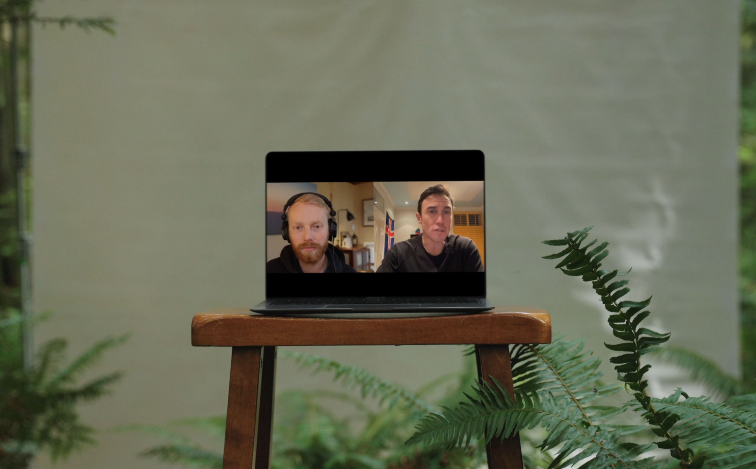
https://youtu.be/Jrj74r6OyoU
“I’ve worked with Cole and the team at Port Side for over a year now and have been super impressed with them. They are smart, fast, authentic, humble, respectful, resourceful, creative, and highly communicative...I’ve literally worked with hundreds of agency’s and creative partners throughout my career, and I can honestly say they are awesome..."
David Zimberoff, VP of Marketing, SRAM
FAQ
What problems is this consulting designed to solve? Most outdoor brands don’t have a creativity problem—they have a clarity problem. This consulting helps uncover the real problem your content could be solving and bringing clarity to your brand positioning, content strategy, and creative direction so your content works harder and provides value to your audience.
What Role do Questions play in this consulting? I believe clarity is found in the art of asking questions, and in many ways I’ve built my entire career around that idea. From hosting the Backcountry Marketing Podcast, to leading discovery sessions with brands, to navigating sales conversations and creative development, my work has always started with asking better questions. Questions uncover the real problem beneath the surface, challenge assumptions teams have carried for years, and force clarity around who you’re talking to, what you actually stand for, and why your work should matter to anyone. Most brands jump straight to ideas—campaigns, content series, new products—before fully understanding the problem they’re trying to solve. But the best ideas rarely come from brainstorming alone; they come from a deeper understanding of the problem, and that understanding comes from asking the right questions.
What's the Cadence? This service is designed to be flexible, whether you need support during a short sprint or over a longer period of time. Engagements start with a minimum commitment of one month.
What's the Difference between this service and a Full Service Project? A custom project is focused on producing something specific—like a campaign, brand film, or a series of social assets. It has a defined scope, timeline, and deliverables. This consulting service is different. Instead of focusing on production, it focuses on the thinking behind the work. It’s an opportunity to step back, ask the right questions, pressure-test ideas, and bring clarity to your brand positioning, content strategy, and creative direction.
Latest Behind the Scenes @function torem($px){
@return calc($px / 16);
}
// a clamping function used for fluid values
@function fluid($fmin, $fmax, $vmin, $vmax){
$fminr: torem($fmin);
$fmaxr: torem($fmax);
$vminr: torem($vmin);
$vmaxr: torem($vmax);
$v: calc(100 * ($fmaxr - $fminr) / ($vmaxr - $vminr));
$r: calc( (($vminr * $fmaxr) - ($vmaxr * $fminr)) / ($vminr - $vmaxr) );
@return clamp(#{$fminr}rem, #{$v}vw + #{$r}rem, #{$fmaxr}rem);
}
$desk-max: 2600;
$desktop-upper: 1440;
$desktop-lower: 1080;
$tablet: 600;
$mobile: 300;
.cards{
@media (max-width:#{$desktop-lower}px){
.col-12{
margin-bottom:fluid(24,32, $desktop-lower, $desktop-upper);
}
.card{
grid-column:span 6;
&:nth-child(4){
grid-column:span 12;
width:100%;
.w-inline-block{
width:100%;
.card-img-wrap{
aspect-ratio:5/3;
width:calc(50% - var(--gap)/2);
img{
width:100%;
height:100%;
object-fit:cover;
}
}
display:flex;
flex-direction:row;
gap: var(--gap);
align-items:end;
}
}
}
}
@media (max-width:#{$tablet}px){
.card{
grid-column:span 12;
&:nth-child(4){
grid-column:span 12;
width:100%;
.w-inline-block{
width:100%;
.card-img-wrap{
aspect-ratio:1;
width:100%;
img{
width:100%;
height:100%;
object-fit:cover;
}
}
flex-direction:column;
gap:0;
align-items:start;
}
}
}
}
}
.card{
display:flex;
flex-direction:column;
gap:fluid(16, 12, $desktop-upper, $desktop-lower);
@media (max-width:#{$desktop-lower}px){
gap:0;
.dot-brow-gray{
margin-top:fluid(12,16, $desktop-lower, $desktop-upper);
}
}
.h4{
transition: color 300ms cubic-bezier(.3,0,0,1);
@media (max-width:#{$desktop-lower}px){
margin-top:#{torem(4)}px;
}
}
.card-img-wrap{
overflow:hidden;
border-radius:var(--radius);
aspect-ratio: 1;
}
img{
object-fit:cover;
width:100%;
height:100%;
object-fit:cover;
@media (max-width:#{$desktop-lower}px){
aspect-ratio:4/5;
}
will-change:transform;
transition: transform 300ms cubic-bezier(.3,0,0,1)
}
&:hover{
img{
transform: scale(1.1);
}
.dot-brow-gray:before{
background-color:var(--red);
}
.h4{
color:var(--white);
}
}
}


