@function torem($px){
@return calc($px / 16);
}
// a clamping function used for fluid values
@function fluid($fmin, $fmax, $vmin, $vmax){
$fminr: torem($fmin);
$fmaxr: torem($fmax);
$vminr: torem($vmin);
$vmaxr: torem($vmax);
$v: calc(100 * ($fmaxr - $fminr) / ($vmaxr - $vminr));
$r: calc( (($vminr * $fmaxr) - ($vmaxr * $fminr)) / ($vminr - $vmaxr) );
@return clamp(#{$fminr}rem, #{$v}vw + #{$r}rem, #{$fmaxr}rem);
}
$desk-max: 2600;
$desktop-upper: 1440;
$desktop-lower: 1080;
$tablet: 600;
$mobile: 300;
$mobile-open-width:70vw;
.navigation{
z-index:1000;
display:flex;
justify-content:space-between;
padding-top:16px;
position:absolute;
}
.nav-links{
position:fixed;
top:0;
right:0;
padding-top:16px;
margin:0;
display:flex;
align-items:end;
justify-content:end;
gap:2px;
z-index:1000;
width:fit-content;
}
.nav-link{
background:rgba(0,0,0,0.65);
position:relative;
border-radius:calc(var(--radius) / 2);
padding:4px 8px;
line-height:1;
font-size:#{torem(12)}rem;
letter-spacing:#{torem(.25)}rem;
transition:background 200ms cubic-bezier(0.3,0,0,1), color 200ms cubic-bezier(0.3,0,0,1), padding 200ms cubic-bezier(0.3,0,0,1);;
&:hover{
background:rgba(255,255,255,1);
color:var(--black);
}
}
.contact-link{
background:rgba(255,255,255,1);
color:var(--black);
position:relative;
display:flex;
align-items:center;
overflow:hidden;
&:before{
content:url('');
width:#{torem(4)}rem;
height:#{torem(4)}rem;
border-radius:1rem;
background-color:var(--red);
position:absolute;
left:-5px;
transition:left 200ms cubic-bezier(0.3,0,0,1);
}
&:hover{
padding-left:11px;
padding-right:5px;
&:before{
left:4px;
}
}
}
.burger{
display:none;
.w-embed{
display:flex;
}
@media (max-width:#{$desktop-lower}px){
display:flex;
}
top: 0;
position: relative;
align-items: center;
justify-content: center;
z-index: 100;
border: 1px solid var(--white);
width: 32px;
height: 32px;
border-radius: 8px;
}
#top, #center, #bottom{
transition: transform 300ms cubic-bezier(0.4,0,0,1);
}
.burger.open{
#top{
transform: rotateZ(45deg) translate(3px, 0px);
}
#center{
transform: scale(0);
}
#bottom{
transform: rotateZ(-45deg) translate(-5px, -2px);
}
}
.burger.open ~ .nav-links_clip{
width:$mobile-open-width;
height:100vh;
}
.hamb{
@media (max-width:#{$desktop-lower}px){
display:flex;
}
}
.nav-links_clip{
@media (max-width:#{$desktop-lower}px){
position:fixed;
height:100vh;
width:0vw;
right:0px;
top:0px;
overflow:hidden;
transition:width 300ms cubic-bezier(0.4,0,0,1);
}
}
.nav-links_wrap{
display:flex;
gap:2px;
transition: transform 300ms cubic-bezier(0.4,0,0,1);
@media (max-width: #{$desktop-lower}px){
flex-direction: column;
position: absolute;
width:$mobile-open-width;
top:0;
padding:16px;
padding-top:80px;
right:0;
background: rgba(0,0,0,.45);
backdrop-filter:blur(12px);
height:100vh;
z-index:1000;
gap: fluid(8, 12, $tablet, $mobile);
.nav-link{
font-size: fluid(14, 16, $tablet, $mobile);
}
}
}
@use 'sass:math';
@function torem($px){
@return calc($px / 16);
}
html,body { padding:0; margin:0;}
// a clamping function used for fluid values
@function fluid($fmin, $fmax, $vmin, $vmax){
$fminr: torem($fmin);
$fmaxr: torem($fmax);
$vminr: torem($vmin);
$vmaxr: torem($vmax);
$v: calc(100 * ($fmaxr - $fminr) / ($vmaxr - $vminr));
$r: calc( (($vminr * $fmaxr) - ($vmaxr * $fminr)) / ($vminr - $vmaxr) );
@return clamp(#{$fminr}rem, #{$v}vw + #{$r}rem, #{$fmaxr}rem);
}
$desk-max: 2600;
$desktop-upper: 1440;
$desktop-lower: 1080;
$tablet: 600;
$mobile: 300;
section, nav{
width:100%;
display: grid;
padding-left: fluid(48, 64, $desktop-lower, $desktop-upper);
padding-right: fluid(48, 64, $desktop-lower, $desktop-upper);
position:relative;
}
.grid-padding-left{
padding-left: fluid(48, 64, $desktop-lower, $desktop-upper);
}
.grid-padding-right{
padding-right: fluid(48, 64, $desktop-lower, $desktop-upper);
}
.grid-padding{
padding-left: fluid(32, 48, $desktop-lower, $desktop-upper);
padding-right: fluid(32, 48, $desktop-lower, $desktop-upper);
}
@media (max-width:#{$tablet}px){
.grid-padding-left{
padding-left: fluid(20, 24, $mobile, $tablet);
}
.grid-padding-right{
padding-right: fluid(20, 24, $mobile, $tablet);
}
.grid-padding{
padding-left: fluid(20, 24, $mobile, $tablet);
padding-right: fluid(20, 24, $mobile, $tablet);
}
}
@media (max-width:#{$desktop-lower}px){
.grid-padding-left{
padding-left: 24px
}
.grid-padding-right{
padding-right: 24px;
}
.grid-padding{
padding-left: fluid(20, 24, $tablet, $desktop-lower);
padding-right: fluid(20, 24, $tablet, $desktop-lower);
}
}
//!------GRID DEFINITIONS------
//------
//grid is desktop first. mobile specific styling is defined with 'm_' and tablet with 't_'
//desktop
@media (min-width:#{($desktop-lower + 1)}px){
section, footer, nav{
width:100%;
padding-left:fluid(48, 64, $desktop-lower, $desktop-upper);
padding-right:fluid(48, 64, $desktop-lower, $desktop-upper);
display: grid;
gap: fluid(32, 48, $desktop-lower, $desktop-upper);
grid-template-columns: repeat(12, 1fr);
grid-auto-rows: auto;
}
@for $i from 1 through 12 {
.col-#{$i} {
grid-column: span #{$i};
}
}
.bleed-left{
margin-left: calc(fluid(48, 64, $desktop-lower, $desktop-upper) * -1);
padding-left:0;
}
.bleed-right{
margin-right: calc(fluid(48, 64, $desktop-lower, $desktop-upper) * -1);
padding-right:0;
}
}
//tablet
@media (max-width:#{$desktop-lower}px){
section, footer, nav{
width:100%;
padding-left: 24px;
padding-right: 24px;
display: grid;
gap: fluid(24, 32, $tablet, $desktop-lower);
grid-template-columns: repeat(12, 1fr);
grid-auto-rows: auto;
}
@for $i from 1 through 12 {
.col-#{$i} {
grid-column: span 12;
gap:var(--gap);
}
}
@for $i from 1 through 12 {
.t_col-#{$i} {
grid-column: span #{$i};
}
}
.bleed-left, .t_bleed-left{
margin-left:-#{torem(24)}rem;
padding-left:0;
}
.bleed-right, .t_bleed-right{
margin-right:-#{torem(24)}rem;
padding-right:0;
}
}
//mobile
@media (max-width:#{$tablet}px){
section, footer, .grid, nav{
width:100%;
padding-left: torem(20)+rem;
padding-right: torem(20)+rem;
display: grid;
gap: fluid(20, 24, $mobile, $tablet);
grid-template-columns: repeat(4, 1fr);
grid-auto-rows: auto;
}
@for $i from 1 through 12 {
.col-#{$i} {
grid-column: span 4;
}
@for $i from 1 through 12 {
.t_col-#{$i} {
grid-column: span #{math.round($i)};
}
}
@for $i from 1 through 12 {
.m_col-#{$i} {
grid-column: span #{$i};
}
}
}
.bleed-left, .t_bleed-left, .m_bleed-left{
margin-left:-#{torem(20)}rem;
padding-left:0;
}
.bleed-right, .t_bleed-right, .m_bleed-right{
margin-right:-#{torem(20)}rem;
padding-right:0;
}
@for $i from 1 through 12{
.sub-grid-#{i}{
display: grid;
width:100%;
grid-auto-rows: auto;
grid-template-columns: repeat(#{$i}, 1fr);
gap:var(--gap);
}
}
}
@for $i from 1 through 12{
.sub-grid-#{$i}{
display: grid;
width:100%;
grid-auto-rows: auto;
grid-template-columns: repeat(#{$i}, 1fr);
gap:var(--gap);
}
}
.home nav{
.link-home{
width:45%;
img{
width:100%;
}
}
.nav-home{
width:100%;
}
}
nav{
.col-6:last-child{
justify-self: end;
}
}
.grid-center{
align-items: center;
}
.flex-column{
display:flex;
flex-direction:column;
}
.t-hidden{
@media(max-width:#{$desktop-lower}px){
display:none;
}
}
.m-hidden{
@media(max-width:#{$tablet}px){
display:none;
}
}
.rich-text{
div{
margin:0;
}
}
@mixin write-spacing($metric, $val-1, $val-2, $val-3, $val-4){
$top: true;
$direction: top;
@for $i from 1 through 2{
@if $top{
$direction: top
} @else{
$direction: bottom;
}
.#{$metric}-#{$direction} {
@media screen and (min-width: #{$mobile}px) {
padding-#{$direction}: #{fluid($val-4, $val-3, $mobile, $tablet)};
}
@media screen and (min-width: #{$tablet}px) {
padding-#{$direction}: #{fluid($val-3, $val-2, $tablet, $desktop-lower)};
}
@media screen and (min-width: #{$desktop-lower}px) {
padding-#{$direction}: #{fluid($val-2, $val-1, $desktop-lower, $desktop-upper)};
}
$top: false;
}
}
.spacer-#{$metric}{
height: #{fluid($val-4, $val-3, $desktop-lower, $desktop-upper)};
position: relative;
display: block;
}
}
@include write-spacing(macro-1, 144, 120, 104, 64);
@include write-spacing(macro-2, 120, 104, 88, 56);
@include write-spacing(macro-3, 96, 80, 31, 32);
@include write-spacing(macro-4, 120, 96, 64, 32);
@include write-spacing(macro-5, 96, 72, 56, 24);
@include write-spacing(macro-6, 64, 56, 48, 24);
@include write-spacing(micro-1, 32, 28, 24, 20);
@include write-spacing(micro-2, 28, 24, 20, 16);
@include write-spacing(micro-3, 20, 16, 12, 8);
@include write-spacing(micro-4, 12, 8, 8, 8);
@function torem($px){
@return calc($px / 16);
}
// a clamping function used for fluid values
@function fluid($fmin, $fmax, $vmin, $vmax){
$fminr: torem($fmin);
$fmaxr: torem($fmax);
$vminr: torem($vmin);
$vmaxr: torem($vmax);
$v: calc(100 * ($fmaxr - $fminr) / ($vmaxr - $vminr));
$r: calc( (($vminr * $fmaxr) - ($vmaxr * $fminr)) / ($vminr - $vmaxr) );
@return clamp(#{$fminr}rem, #{$v}vw + #{$r}rem, #{$fmaxr}rem);
}
$desk-max: 2600;
$desktop-upper: 1920;
$desktop-lower: 1080;
$tablet: 600;
$mobile: 300;
*{
font-family: neue-haas-grotesk-text, helvetica, arial, sans-serif;
font-smooth: always;
-webkit-font-smoothing:antialiased;
-moz-osx-font-smoothing:grayscale;
}
@for $i from 1 through 6{
.h#{$i}, h#{$i}{
font-family: neue-haas-grotesk-display, helvetica, arial, sans-serif;
font-weight:450;
strong{
font-family: neue-haas-grotesk-display, helvetica, arial, sans-serif;
font-weight:450;
}
}
}
.text-white{
color:var(--white);
}
.text-center{
text-align:center;
}
strong, b{
font-weight:normal;
color:var(--white);
}
.h1{
font-size: fluid( 64, 72, $desktop-lower, $desktop-upper) !important;
margin:0;
line-height: 1;
text-wrap:balance;
@media (max-width:#{$tablet}px){
font-size: fluid( 40, 56, $mobile, $tablet) !important;
line-height: 1.1;
}
@media (max-width:#{$desktop-lower}px){
font-size: fluid( 36, 42, $tablet, $desktop-lower) !important;
}
}
.h2{
font-size: fluid( 40, 48, $desktop-lower, $desktop-upper);
margin:0;
line-height:1.4;
text-wrap: balance;
@media (max-width:#{$desktop-lower}px){
font-size: fluid( 32, 40, $tablet, $desktop-lower) !important;
}
@media (max-width:#{$tablet}px){
font-size: fluid( 24, 32, $mobile, $tablet) !important;
line-height: 1.1;
}
}
.h3{
font-size: fluid( 28, 34, $desktop-lower, 1920) !important;
margin:0;
text-transform:none;
@media (max-width:#{$desktop-lower}px){
font-size: fluid( 26, 28, $tablet, $desktop-lower) !important;
}
@media (max-width:#{$tablet}px){
font-size: fluid( 24, 26, $mobile, $tablet) !important;
line-height: 1.1;
}
}
.h4{
font-size: fluid( 24, 28, $desktop-lower, 1920) !important;
font-weight: 450;
margin:0;
line-height:1.25;
text-transform:none;
@media (max-width:#{$desktop-lower}px){
font-size: fluid( 20, 24, $tablet, $desktop-lower) !important;
@media (max-width:#{$tablet}px){
font-size: #{torem(20)}rem;
}
}
}
.h5{
margin:0;
}
.h6{
font-size: fluid( 16, 16, $desktop-lower, $desktop-upper) !important;
font-weight: 400;
margin:0;
text-transform:uppercase;
letter-spacing:.8px;
@media (max-width:#{$desktop-lower}px){
font-size:fluid(14,16, $tablet, $desktop-lower);
}
@media(max-width:#{$tablet}px){
font-size:#{torem(14)}rem;
}
}
.dot-brow{
font-size: fluid( 16, 16, $desktop-lower, $desktop-upper) !important;
font-weight: 400;
margin:0;
text-transform:uppercase;
letter-spacing:.8px;
&:before{
content:url();
background-color:var(--red);
width: #{torem(6)}rem;
height: #{torem(6)}rem;
border-radius:#{torem(12)}rem;
display:block;
}
display:flex;
align-items:center;
gap:#{torem(8)}rem;
}
.dot-brow-gray{
font-family: neue-haas-grotesk-display, helvetica, arial, sans-serif;
font-weight:450;
font-size: fluid( 14, 16, $desktop-lower, $desktop-upper) !important;
font-weight: 400;
margin:0;
text-transform:uppercase;
letter-spacing:.8px;
color: var(--text-gray);
&:before{
content:url();
background-color:var(--text-gray);
width: #{torem(6)}rem;
height: #{torem(6)}rem;
border-radius:#{torem(12)}rem;
display:block;
}
display:flex;
align-items:center;
gap:#{torem(8)}rem;
}
.p1{
font-size: fluid( 18, 20, $desktop-lower, $desktop-upper);
margin:0;
line-height:1.5;
@media (max-width:#{$desktop-lower}px){
font-size: #{torem(16)}rem;
}
@media (max-width:#{$tablet}px){
font-size: #{torem(16)}rem;
}
}
.legal{
font-size:#{torem(14)}rem;
letter-spacing:#{torem(1)}rem;
text-transform:uppercase;
color:var(--text-gray);
a{
color: var(--text-gray);
text-decoration:none;
transition:color 250ms cubic-bezier(.3,0,0,1);
&:hover{
color:var(--white);
}
}
@media (max-width:#{$desktop-lower}px){
font-size:fluid(12,14,$tablet,$desktop-lower)
}
@media (max-width:#{$tablet}px){
font-size:fluid(10,12,$mobile,$tablet)
}
}
.quote{
font-size: fluid( 40, 64, $desktop-lower, $desktop-upper);
margin:0;
line-height:1.25;
@media (max-width:#{$desktop-lower}px){
font-size: fluid( 36, 40, $tablet, $desktop-lower);
}
@media (max-width:#{$tablet}px){
font-size: fluid( 32, 36, $mobile, $tablet);
}
}
.quote-serif{
font-family:ppeiko, times, serif;
font-style:italic;
}
.button{
font-size: fluid(18, 20, $desktop-lower, $desktop-upper);
@media (max-width:#{$desktop-lower}px){
font-size: fluid( 16, 18, $tablet, $desktop-lower);
}
@media (max-width:#{$tablet}px){
font-size: 1rem;
}
}
.text-field-label{
position:relative;
top:0;
left:0;
font-weight:normal;
line-height:1;
font-size:#{torem(12)}rem;
text-transform:uppercase;
letter-spacing:#{torem(.25)}rem;
}
.h1 + .p1{
margin-top:.5rem;
}
.h2 + .p1{
margin-top:fluid(12,8, $desktop-lower, $desktop-upper);
}
.h3 + .p1{
margin-top:fluid(8, 6, $desktop-lower, $desktop-upper);
}
.h5-list{
.p1 + .h5{
margin-top:8px;
}
}
.dot-brow + h3{
margin-top:fluid(16,20,$desktop-lower,$desktop-upper);
}
.dot-brow + .h1{
margin-top:fluid(16,20,$desktop-lower,$desktop-upper);
}
.h6 + .h1{
margin-top:fluid(16,20,$desktop-lower,$desktop-upper);
}
.h6 + .p1, .dot-brow + .p1{
margin-top: fluid(16, 24, $desktop-lower, $desktop-upper);
@media(max-width:#{$desktop-lower}px){
margin-top:(8,16, $tablet, $desktop-lower)
}
@media(max-width:#{$tablet}px){
margin-top:.5rem;
}
}
.p1 + .button, .p1 + .button-group{
margin-top: fluid(24, 32, $desktop-lower, $desktop-upper);
}
.rich-text + .button, .rich-text + .button-outline, .rich-text + .button-group{
margin-top:fluid(32,40,$desktop-lower, $desktop-upper);
} body{
background: var(--black);
color: var(--white);
}
.sticky{
position:sticky;
}
.section-last{
background: var(--black);
position:relative;
z-index:2;
}
.rounded{
border-radius:var(--radius);
}
.flex-between-vertical{
display:flex;
flex-direction:column;
justify-content:space-between;
height:100%;
}
.row-gap-none{
row-gap:0;
}
.product-card{
.product-card_content{
display:flex;
flex-direction:column;
gap:1rem;
}
@media (max-width:1080px){
flex-direction:row;
.product-card-image, .product-card-content{
width:50%;
}
}
@media (max-width:600px){
flex-direction:column;
.product-card-image, .product-card-content{
width:100%;
}
}
}
.t-hidden{
@media (max-width:1080px){
display:none;
}
}
.w-button{
font-family:inherit;
padding:0;
pointer-events:auto;
}
input[type=submit]{
transition: padding 200ms cubic-bezier(0.4,0,0,1);
}
.button-wrapper {
pointer-events: none;
border-radius:8px;
overflow:hidden;
&:before{
top:7.5px;
}
&:hover{
background-color:var(--_colors---black);
input{
padding-left:32px;
padding-right:12px;
}
padding:0;
}
}
.submit-button{
padding:8px 22px;
}
.button-outline, .button-reverse{
&::before{
content:url(https://cdn.prod.website-files.com/6780a187f1bff60a0924e333/6792feeda5be3c6114392385_arrow-right.svg)
}
}
.balance-wrap{
text-wrap:balance;
}
.sub-hero{
.h2, .quote{
text-wrap: balance;
}
}
.display-none{
display:none;
}
.live-hide{
display:none;
}
.video-link{
display:none;
}
.editor{
.video-link{
display:block;
}
.live-hide{
display:block;
}
}
.inline-video{
.video-embed{
width:100%;
border-radius:var(--radius);
aspect-ratio: 16/9;
}
}
.ball{
width:8px;
height:8px;
border-radius:9000px;
background:var(--red);
z-index:1111;
position:fixed;
display:none;
pointer-events: none;
} .gray{
color:var(--text-gray);
}
.white{
color:var(--white);
}
.black{
color:var(--black);
} @function torem($px){
@return calc($px / 16);
}
// a clamping function used for fluid values
@function fluid($fmin, $fmax, $vmin, $vmax){
$fminr: torem($fmin);
$fmaxr: torem($fmax);
$vminr: torem($vmin);
$vmaxr: torem($vmax);
$v: calc(100 * ($fmaxr - $fminr) / ($vmaxr - $vminr));
$r: calc( (($vminr * $fmaxr) - ($vmaxr * $fminr)) / ($vminr - $vmaxr) );
@return clamp(#{$fminr}rem, #{$v}vw + #{$r}rem, #{$fmaxr}rem);
}
$desk-max: 2600;
$desktop-upper: 1920;
$desktop-lower: 1080;
$tablet: 600;
$mobile: 300;
.button, .button-outline, .button-reverse, .button-wrapper{
transition: padding 200ms cubic-bezier(0.3,0,0,1);
will-change: padding;
position:relative;
display:block;
overflow:hidden;
width:fit-content;
border-radius: var(--radius);
padding: #{torem(12)}rem #{torem(24)}rem;
text-transform: uppercase;
font-size:#{torem(12)}rem;
line-height:1;
&::before{
content:url();
position:absolute;
left:-14px;
top: #{torem(14)}rem;
width:#{torem(8)}rem;
height:#{torem(8)}rem;
border-radius:100px;
background: var(--red);
transition: transform 200ms cubic-bezier(0.3,0,0,1);
}
&:hover{
padding-left:#{torem(32)}rem;
padding-right:#{torem(16)}rem;
&:before{
transform: translateX(#{torem(28)}rem);
}
}
}
.button{
background:var(--white);
color:var(--black);
border:none;
}
.button-outline{
color:var(--white);
border:1px solid var(--white);
}
.button-group{
display:flex;
gap: fluid(24, 32, $desktop-lower, $desktop-upper);
flex-wrap:wrap;
}
@use 'sass:math';
@function torem($px){
@return calc($px / 16);
}
// a clamping function used for fluid values
@function fluid($fmin, $fmax, $vmin, $vmax){
$fminr: torem($fmin);
$fmaxr: torem($fmax);
$vminr: torem($vmin);
$vmaxr: torem($vmax);
$v: calc(100 * ($fmaxr - $fminr) / ($vmaxr - $vminr));
$r: calc( (($vminr * $fmaxr) - ($vmaxr * $fminr)) / ($vminr - $vmaxr) );
@return clamp(#{$fminr}rem, #{$v}vw + #{$r}rem, #{$fmaxr}rem);
}
$desk-max: 2600;
$desktop-upper: 1440;
$desktop-lower: 1080;
$tablet: 600;
$mobile: 300;
$center: 764px;
// EVERYTHING WRAPPED IN RICH TEXT DIV
.rich-text *{
max-width:$center;
margin: 0px auto;
}
.case-study, .methodology{
.rich-text *{
max-width:none;
}
}
.rich-text{
.w-richtext-figure-type-video{
margin-top: fluid(56, 72, $desktop-lower, $desktop-upper);
margin-bottom: fluid(56, 72, $desktop-lower, $desktop-upper);
}
w-richtext-figure-type-image{
margin-top: fluid(72, 96, $desktop-lower, $desktop-upper);
margin-bottom: fluid(72, 96, $desktop-lower, $desktop-upper);
}
.w-richtext-align-fullwidth, .w-richtext-figure-type-video{
max-width:100%;
img{
max-width:none;
}
iframe{
max-width:none;
}
div{
max-width:none;
}
}
.w-richtext-align-center{
max-width: $center;
div, img{
max-width: none;
}
}
p{
color: var(--text-gray);
font-size: fluid( 18, 20, $desktop-lower, $desktop-upper);
margin:0;
line-height:1.5;
@media (max-width:#{$desktop-lower}px){
font-size: #{torem(16)}rem;
}
@media (max-width:#{$tablet}px){
font-size: #{torem(16)}rem;
}
}
a{
color: var(--white);
text-decoration:underline;
text-decoration-thickness:#{torem(1.5)}rem !important;
transition:color 250ms cubic-bezier(0.3,0,0,1);
&:hover{
color:var(--text-gray);
}
}
ol,ul{
color: var(--text-gray);
li{
color: var(--text-gray);
font-size: fluid( 18, 20, $desktop-lower, $desktop-upper);
margin:0;
line-height:1.5;
@media (max-width:#{$desktop-lower}px){
font-size: #{torem(16)}rem;
}
@media (max-width:#{$tablet}px){
font-size: #{torem(16)}rem;
}
}
}
strong, b{
font-weight:400;
color: var(--white);
}
blockquote{
max-width: none;
border:none;
padding:0;
font-size: fluid( 18, 20, $desktop-lower, $desktop-upper);
margin:0;
line-height:1.5;
@media (max-width:#{$desktop-lower}px){
font-size: fluid(16, 18, $desktop-lower, $desktop-upper);
}
@media (max-width:#{$tablet}px){
font-size: #{torem(16)}rem;
}
}
figcaption{
text-align:left;
width:100%;
color:var(--text-gray);
margin-top:#{torem(4)}rem;
max-width:none;
}
h1{
font-size: fluid( 64, 72, $desktop-lower, $desktop-upper) !important;
line-height: 1;
text-wrap:balance;
@media (max-width:#{$tablet}px){
font-size: fluid( 40, 56, $mobile, $tablet) !important;
line-height: 1.1;
}
@media (max-width:#{$desktop-lower}px){
font-size: fluid( 56, 64, $tablet, $desktop-lower) !important;
}
}
h2{
font-size: fluid( 40, 48, $desktop-lower, $desktop-upper);
line-height:1;
text-wrap: balance;
@media (max-width:#{$desktop-lower}px){
font-size: fluid( 32, 40, $tablet, $desktop-lower) !important;
}
@media (max-width:#{$tablet}px){
font-size: fluid( 24, 32, $mobile, $tablet) !important;
line-height: 1.1;
}
}
h3{
font-size: fluid( 28, 34, $desktop-lower, 1920) !important;
text-transform:none;
@media (max-width:#{$desktop-lower}px){
font-size: fluid( 24, 28, $tablet, $desktop-lower) !important;
}
@media (max-width:#{$tablet}px){
font-size: fluid( 20, 24, $mobile, $tablet) !important;
line-height: 1.1;
}
}
h4{
font-size: fluid( 24, 28, $desktop-lower, 1920) !important;
font-weight: 450;
line-height:1.25;
text-transform:none;
margin: 0px;
@media (max-width:#{$desktop-lower}px){
font-size: fluid( 24, 32, $tablet, $desktop-lower) !important;
@media (max-width:#{$tablet}px){
font-size: #{torem(20)}rem;
}
}
}
h5{
}
h6{
font-size: fluid(16, 16, $desktop-lower, $desktop-upper) !important;
font-weight: 400;
text-transform:uppercase;
letter-spacing:.8px;
}
li{
font-size: fluid(18, 20, $desktop-lower, $desktop-upper);
}
p1{
font-size: fluid( 18, 20, $desktop-lower, $desktop-upper);
margin:0;
line-height:1.5;
@media (max-width:#{$desktop-lower}px){
font-size: fluid(16, 18, $desktop-lower, $desktop-upper);
}
@media (max-width:#{$tablet}px){
font-size: #{torem(16)}rem;
}
}
h1 + p{
margin-top:1rem;
}
h1 + h3{
margin-top: fluid(20,28, $desktop-lower,$desktop-upper)
}
h2 + p{
margin-top:1rem;
}
h3 + p{
margin-top: .75rem;
}
h2 + p{
margin-top: 1rem;
}
h3 + ul, h3 + ol{
margin-top: .5rem;
}
h4 + p{
margin-top: .5rem;
}
h5+ul, h5+ol{
margin-top:fluid(8, 16, $desktop-lower, $desktop-upper)
}
blockquote + blockquote{
margin-top: fluid(56, 72, $desktop-lower, $desktop-upper);
}
blockquote + p{
margin-top: fluid(64, 72, $desktop-lower, $desktop-upper);
}
p + h2{
margin-top:4rem;
}
p + h3{
margin-top:3rem;
}
p + h4{
margin-top: fluid(40, 48, $desktop-lower, $desktop-upper)
}
p + h5{
margin-top: fluid( 18*1.5, 20*1.5, $desktop-lower, $desktop-upper);
}
p + blockquote{
margin-top: fluid(64, 72, $desktop-lower, $desktop-upper);
}
p + p {
margin-top: fluid( 18*1.5, 20*1.5, $desktop-lower, $desktop-upper);
}
ol + h3, ul + h3{
margin-top: fluid(64, 72, $desktop-lower, $desktop-upper);
}
ol + h4, ul + h4{
margin-top: fluid(64, 72, $desktop-lower, $desktop-upper);
}
ol+h5, ul+h5{
margin-top: fluid(24, 32, $desktop-lower, $desktop-upper);
}
p + ul, p + ol{
margin-top: fluid(12, 16, $desktop-lower, $desktop-upper);
}
ul + p, ol + p{
margin-top: fluid(24, 32, $desktop-lower, $desktop-upper);
}
ul{
align-content:start;
margin:0;
}
ol li::marker{
color: var(--white);
text-align:left;
}
figure, .inline-video{
margin-top:fluid(56,80, $desktop-lower, $desktop-upper);
margin-bottom:fluid(56,72, $desktop-lower, $desktop-upper);
}
}
.split-image{
row-gap:.5rem;
.half-image img{
aspect-ratio:1;
object-fit:cover;
width:100%;
border-radius:var(--radius);
}
}
.three-image{
row-gap:.5rem;
img{
aspect-ratio:1;
object-fit:cover;
width:100%;
border-radius:var(--radius);
}
}
.inline-video{
position:relative;
.video-embed{
width:100%;
border-radius:var(--radius);
aspect-ratio: 16/9;
}
}
.play{
.play-icon{
display:none;
}
}
.pause{
.pause-icon{
display:none;
}
}
.full-width-image{
row-gap:.5rem;
img{
width:100%;
max-height:100vh;
object-fit:cover;
border-radius:var(--radius);
}
}
.yt-video-embed{
width: 100%;
aspect-ratio: 16 / 9;
}
.case-results{
position:sticky;
height:fit-content;
top:0;
}
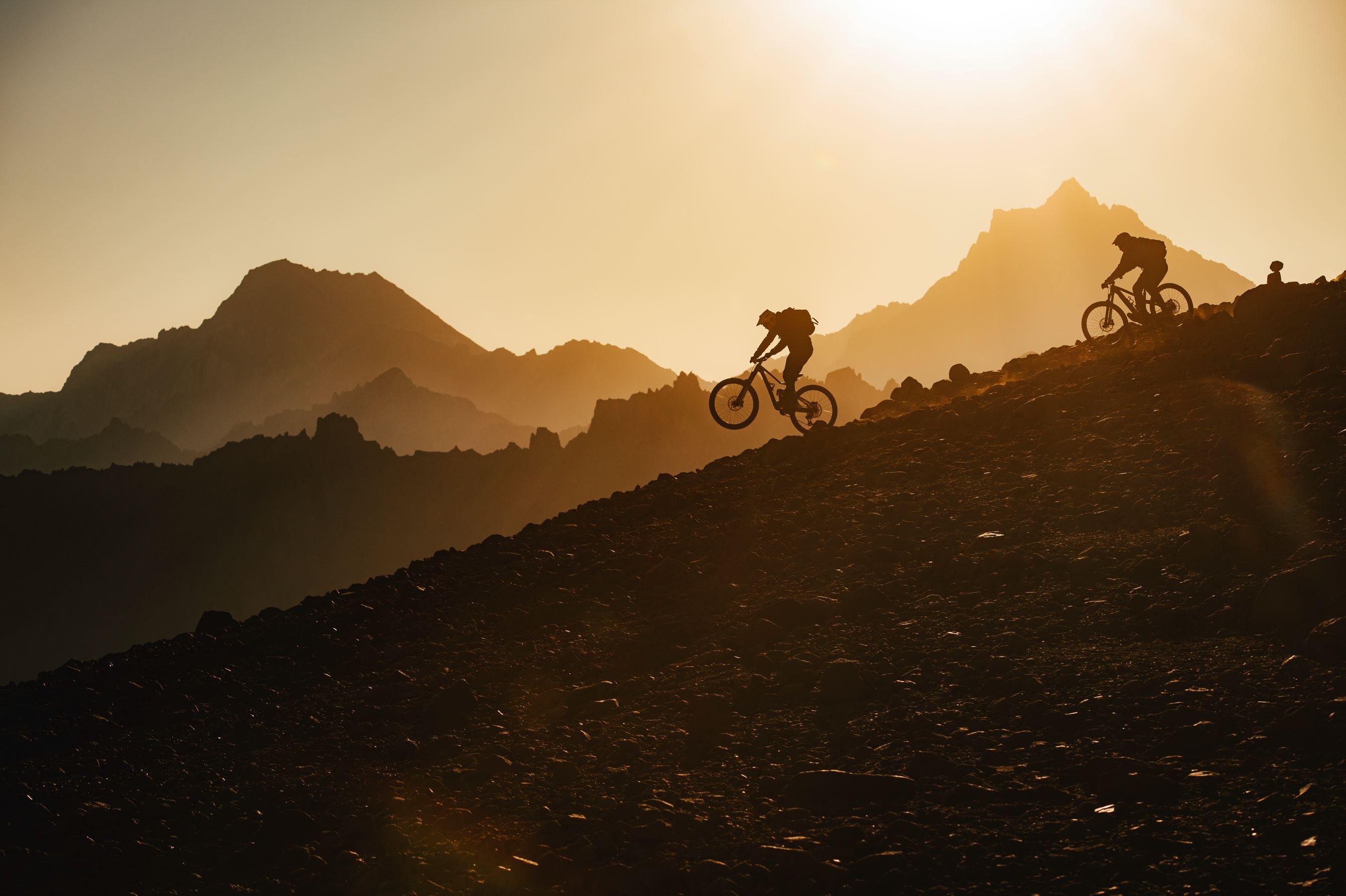
SRAM GX Eagle Launch To launch the GX Eagle Transmission, SRAM wanted more than a product showcase. They wanted a story that captured the grit and ambition of real adventure. Using athlete-shot footage from a self-supported ascent of Mt. Tupungato, we built a narrative centered on resilience, uncertainty, and trust in your gear. Through interviews and careful storytelling, we turned raw expedition content into an emotionally compelling film that highlighted the product’s reliability in the most demanding conditions.
Deliverables 13-minute hero film
Two, 30 second trailers
Services Production
Post-Production
https://www.youtube.com/watch?v=IpWTOFZYM-Y&t=1s&ab_channel=SRAM
Margus Riga and Kenny Smith
Emotional Goal We wanted viewers to feel the grit, unpredictability, and ambition of an expedition-level adventure. More than showcasing features, the goal was to inspire riders to trust their gear and chase the edge, knowing the product would hold up when it mattered most.
The Mission SRAM was preparing to launch the GX Eagle Transmission, a drivetrain built for durability, performance, and the hardest days on the bike. The mission was to help the launch resonate emotionally, using a real-world story to prove the product's reliability. We were tasked with transforming an ascent of Mt. Tupungato in Argentina into the narrative engine that would drive this launch.
Photo Credit: Margus Riga
The Approach SRAM handed us a unique challenge: bring a story to life using footage and photos shot by the athletes themselves.
Here’s how we approached it:
We conducted in-depth interviews with Margus Riga and Kenny Smith to map out the emotional and physical arc of their expedition. We built a narrative beat sheet around themes of resilience, uncertainty, and the pursuit of something just out of reach. Using both their supplied footage, we also filmed interviews with the athletes to form the backbone of the story. We sifted through raw footage and stills to uncover the emotional spine of the adventure, then built a cohesive arc that honored both the journey and the product.
Testimonial “I reached out to Port Side Productions for their help in leveraging an already-shot project in a new and exciting way. Pushing content beyond its original intent is never easy, and Cole’s team took on this challenge to find creative solutions and they did so with efficiency. The project had stunning photography, but it was the team at Port Side that pulled together a strong narrative thread. They did a fantastic job of taking a massive and unrelatable athletic feat, and humanized it through personalized storytelling.”
Stephen Matthews, Content Production Manager
Impact This video launched on SRAM's YouTube Channel alongside the rest of the GX Eagle Campaign
Credits Directors: Photographer:
Latest Industry insights, recents from the Backcountry Marketing Podcast and more @function torem($px){
@return calc($px / 16);
}
// a clamping function used for fluid values
@function fluid($fmin, $fmax, $vmin, $vmax){
$fminr: torem($fmin);
$fmaxr: torem($fmax);
$vminr: torem($vmin);
$vmaxr: torem($vmax);
$v: calc(100 * ($fmaxr - $fminr) / ($vmaxr - $vminr));
$r: calc( (($vminr * $fmaxr) - ($vmaxr * $fminr)) / ($vminr - $vmaxr) );
@return clamp(#{$fminr}rem, #{$v}vw + #{$r}rem, #{$fmaxr}rem);
}
$desk-max: 2600;
$desktop-upper: 1440;
$desktop-lower: 1080;
$tablet: 600;
$mobile: 300;
.cards{
@media (max-width:#{$desktop-lower}px){
.col-12{
margin-bottom:fluid(24,32, $desktop-lower, $desktop-upper);
}
.card{
grid-column:span 6;
&:nth-child(4){
grid-column:span 12;
width:100%;
.w-inline-block{
width:100%;
.card-img-wrap{
aspect-ratio:5/3;
width:calc(50% - var(--gap)/2);
img{
width:100%;
height:100%;
object-fit:cover;
}
}
display:flex;
flex-direction:row;
gap: var(--gap);
align-items:end;
}
}
}
}
@media (max-width:#{$tablet}px){
.card{
grid-column:span 12;
&:nth-child(4){
grid-column:span 12;
width:100%;
.w-inline-block{
width:100%;
.card-img-wrap{
aspect-ratio:1;
width:100%;
img{
width:100%;
height:100%;
object-fit:cover;
}
}
flex-direction:column;
gap:0;
align-items:start;
}
}
}
}
}
.card{
display:flex;
flex-direction:column;
gap:fluid(16, 12, $desktop-upper, $desktop-lower);
@media (max-width:#{$desktop-lower}px){
gap:0;
.dot-brow-gray{
margin-top:fluid(12,16, $desktop-lower, $desktop-upper);
}
}
.h4{
transition: color 300ms cubic-bezier(.3,0,0,1);
@media (max-width:#{$desktop-lower}px){
margin-top:#{torem(4)}px;
}
}
.card-img-wrap{
overflow:hidden;
border-radius:var(--radius);
aspect-ratio: 1;
}
img{
object-fit:cover;
width:100%;
height:100%;
object-fit:cover;
@media (max-width:#{$desktop-lower}px){
aspect-ratio:4/5;
}
will-change:transform;
transition: transform 300ms cubic-bezier(.3,0,0,1)
}
&:hover{
img{
transform: scale(1.1);
}
.dot-brow-gray:before{
background-color:var(--red);
}
.h4{
color:var(--white);
}
}
}


-2.png)


