@function torem($px){
@return calc($px / 16);
}
// a clamping function used for fluid values
@function fluid($fmin, $fmax, $vmin, $vmax){
$fminr: torem($fmin);
$fmaxr: torem($fmax);
$vminr: torem($vmin);
$vmaxr: torem($vmax);
$v: calc(100 * ($fmaxr - $fminr) / ($vmaxr - $vminr));
$r: calc( (($vminr * $fmaxr) - ($vmaxr * $fminr)) / ($vminr - $vmaxr) );
@return clamp(#{$fminr}rem, #{$v}vw + #{$r}rem, #{$fmaxr}rem);
}
$desk-max: 2600;
$desktop-upper: 1440;
$desktop-lower: 1080;
$tablet: 600;
$mobile: 300;
$mobile-open-width:70vw;
.navigation{
z-index:1000;
display:flex;
justify-content:space-between;
padding-top:16px;
position:absolute;
}
.nav-links{
position:fixed;
top:0;
right:0;
padding-top:16px;
margin:0;
display:flex;
align-items:end;
justify-content:end;
gap:2px;
z-index:1000;
width:fit-content;
}
.nav-link{
background:rgba(0,0,0,0.65);
position:relative;
border-radius:calc(var(--radius) / 2);
padding:4px 8px;
line-height:1;
font-size:#{torem(12)}rem;
letter-spacing:#{torem(.25)}rem;
transition:background 200ms cubic-bezier(0.3,0,0,1), color 200ms cubic-bezier(0.3,0,0,1), padding 200ms cubic-bezier(0.3,0,0,1);;
&:hover{
background:rgba(255,255,255,1);
color:var(--black);
}
}
.contact-link{
background:rgba(255,255,255,1);
color:var(--black);
position:relative;
display:flex;
align-items:center;
overflow:hidden;
&:before{
content:url('');
width:#{torem(4)}rem;
height:#{torem(4)}rem;
border-radius:1rem;
background-color:var(--red);
position:absolute;
left:-5px;
transition:left 200ms cubic-bezier(0.3,0,0,1);
}
&:hover{
padding-left:11px;
padding-right:5px;
&:before{
left:4px;
}
}
}
.burger{
display:none;
.w-embed{
display:flex;
}
@media (max-width:#{$desktop-lower}px){
display:flex;
}
top: 0;
position: relative;
align-items: center;
justify-content: center;
z-index: 100;
border: 1px solid var(--white);
width: 32px;
height: 32px;
border-radius: 8px;
}
#top, #center, #bottom{
transition: transform 300ms cubic-bezier(0.4,0,0,1);
}
.burger.open{
#top{
transform: rotateZ(45deg) translate(3px, 0px);
}
#center{
transform: scale(0);
}
#bottom{
transform: rotateZ(-45deg) translate(-5px, -2px);
}
}
.burger.open ~ .nav-links_clip{
width:$mobile-open-width;
height:100vh;
}
.hamb{
@media (max-width:#{$desktop-lower}px){
display:flex;
}
}
.nav-links_clip{
@media (max-width:#{$desktop-lower}px){
position:fixed;
height:100vh;
width:0vw;
right:0px;
top:0px;
overflow:hidden;
transition:width 300ms cubic-bezier(0.4,0,0,1);
}
}
.nav-links_wrap{
display:flex;
gap:2px;
transition: transform 300ms cubic-bezier(0.4,0,0,1);
@media (max-width: #{$desktop-lower}px){
flex-direction: column;
position: absolute;
width:$mobile-open-width;
top:0;
padding:16px;
padding-top:80px;
right:0;
background: rgba(0,0,0,.45);
backdrop-filter:blur(12px);
height:100vh;
z-index:1000;
gap: fluid(8, 12, $tablet, $mobile);
.nav-link{
font-size: fluid(14, 16, $tablet, $mobile);
}
}
}
@use 'sass:math';
@function torem($px){
@return calc($px / 16);
}
html,body { padding:0; margin:0;}
// a clamping function used for fluid values
@function fluid($fmin, $fmax, $vmin, $vmax){
$fminr: torem($fmin);
$fmaxr: torem($fmax);
$vminr: torem($vmin);
$vmaxr: torem($vmax);
$v: calc(100 * ($fmaxr - $fminr) / ($vmaxr - $vminr));
$r: calc( (($vminr * $fmaxr) - ($vmaxr * $fminr)) / ($vminr - $vmaxr) );
@return clamp(#{$fminr}rem, #{$v}vw + #{$r}rem, #{$fmaxr}rem);
}
$desk-max: 2600;
$desktop-upper: 1440;
$desktop-lower: 1080;
$tablet: 600;
$mobile: 300;
section, nav{
width:100%;
display: grid;
padding-left: fluid(48, 64, $desktop-lower, $desktop-upper);
padding-right: fluid(48, 64, $desktop-lower, $desktop-upper);
position:relative;
}
.grid-padding-left{
padding-left: fluid(48, 64, $desktop-lower, $desktop-upper);
}
.grid-padding-right{
padding-right: fluid(48, 64, $desktop-lower, $desktop-upper);
}
.grid-padding{
padding-left: fluid(32, 48, $desktop-lower, $desktop-upper);
padding-right: fluid(32, 48, $desktop-lower, $desktop-upper);
}
@media (max-width:#{$tablet}px){
.grid-padding-left{
padding-left: fluid(20, 24, $mobile, $tablet);
}
.grid-padding-right{
padding-right: fluid(20, 24, $mobile, $tablet);
}
.grid-padding{
padding-left: fluid(20, 24, $mobile, $tablet);
padding-right: fluid(20, 24, $mobile, $tablet);
}
}
@media (max-width:#{$desktop-lower}px){
.grid-padding-left{
padding-left: 24px
}
.grid-padding-right{
padding-right: 24px;
}
.grid-padding{
padding-left: fluid(20, 24, $tablet, $desktop-lower);
padding-right: fluid(20, 24, $tablet, $desktop-lower);
}
}
//!------GRID DEFINITIONS------
//------
//grid is desktop first. mobile specific styling is defined with 'm_' and tablet with 't_'
//desktop
@media (min-width:#{($desktop-lower + 1)}px){
section, footer, nav{
width:100%;
padding-left:fluid(48, 64, $desktop-lower, $desktop-upper);
padding-right:fluid(48, 64, $desktop-lower, $desktop-upper);
display: grid;
gap: fluid(32, 48, $desktop-lower, $desktop-upper);
grid-template-columns: repeat(12, 1fr);
grid-auto-rows: auto;
}
@for $i from 1 through 12 {
.col-#{$i} {
grid-column: span #{$i};
}
}
.bleed-left{
margin-left: calc(fluid(48, 64, $desktop-lower, $desktop-upper) * -1);
padding-left:0;
}
.bleed-right{
margin-right: calc(fluid(48, 64, $desktop-lower, $desktop-upper) * -1);
padding-right:0;
}
}
//tablet
@media (max-width:#{$desktop-lower}px){
section, footer, nav{
width:100%;
padding-left: 24px;
padding-right: 24px;
display: grid;
gap: fluid(24, 32, $tablet, $desktop-lower);
grid-template-columns: repeat(12, 1fr);
grid-auto-rows: auto;
}
@for $i from 1 through 12 {
.col-#{$i} {
grid-column: span 12;
gap:var(--gap);
}
}
@for $i from 1 through 12 {
.t_col-#{$i} {
grid-column: span #{$i};
}
}
.bleed-left, .t_bleed-left{
margin-left:-#{torem(24)}rem;
padding-left:0;
}
.bleed-right, .t_bleed-right{
margin-right:-#{torem(24)}rem;
padding-right:0;
}
}
//mobile
@media (max-width:#{$tablet}px){
section, footer, .grid, nav{
width:100%;
padding-left: torem(20)+rem;
padding-right: torem(20)+rem;
display: grid;
gap: fluid(20, 24, $mobile, $tablet);
grid-template-columns: repeat(4, 1fr);
grid-auto-rows: auto;
}
@for $i from 1 through 12 {
.col-#{$i} {
grid-column: span 4;
}
@for $i from 1 through 12 {
.t_col-#{$i} {
grid-column: span #{math.round($i)};
}
}
@for $i from 1 through 12 {
.m_col-#{$i} {
grid-column: span #{$i};
}
}
}
.bleed-left, .t_bleed-left, .m_bleed-left{
margin-left:-#{torem(20)}rem;
padding-left:0;
}
.bleed-right, .t_bleed-right, .m_bleed-right{
margin-right:-#{torem(20)}rem;
padding-right:0;
}
@for $i from 1 through 12{
.sub-grid-#{i}{
display: grid;
width:100%;
grid-auto-rows: auto;
grid-template-columns: repeat(#{$i}, 1fr);
gap:var(--gap);
}
}
}
@for $i from 1 through 12{
.sub-grid-#{$i}{
display: grid;
width:100%;
grid-auto-rows: auto;
grid-template-columns: repeat(#{$i}, 1fr);
gap:var(--gap);
}
}
.home nav{
.link-home{
width:45%;
img{
width:100%;
}
}
.nav-home{
width:100%;
}
}
nav{
.col-6:last-child{
justify-self: end;
}
}
.grid-center{
align-items: center;
}
.flex-column{
display:flex;
flex-direction:column;
}
.t-hidden{
@media(max-width:#{$desktop-lower}px){
display:none;
}
}
.m-hidden{
@media(max-width:#{$tablet}px){
display:none;
}
}
.rich-text{
div{
margin:0;
}
}
@mixin write-spacing($metric, $val-1, $val-2, $val-3, $val-4){
$top: true;
$direction: top;
@for $i from 1 through 2{
@if $top{
$direction: top
} @else{
$direction: bottom;
}
.#{$metric}-#{$direction} {
@media screen and (min-width: #{$mobile}px) {
padding-#{$direction}: #{fluid($val-4, $val-3, $mobile, $tablet)};
}
@media screen and (min-width: #{$tablet}px) {
padding-#{$direction}: #{fluid($val-3, $val-2, $tablet, $desktop-lower)};
}
@media screen and (min-width: #{$desktop-lower}px) {
padding-#{$direction}: #{fluid($val-2, $val-1, $desktop-lower, $desktop-upper)};
}
$top: false;
}
}
.spacer-#{$metric}{
height: #{fluid($val-4, $val-3, $desktop-lower, $desktop-upper)};
position: relative;
display: block;
}
}
@include write-spacing(macro-1, 144, 120, 104, 64);
@include write-spacing(macro-2, 120, 104, 88, 56);
@include write-spacing(macro-3, 96, 80, 31, 32);
@include write-spacing(macro-4, 120, 96, 64, 32);
@include write-spacing(macro-5, 96, 72, 56, 24);
@include write-spacing(macro-6, 64, 56, 48, 24);
@include write-spacing(micro-1, 32, 28, 24, 20);
@include write-spacing(micro-2, 28, 24, 20, 16);
@include write-spacing(micro-3, 20, 16, 12, 8);
@include write-spacing(micro-4, 12, 8, 8, 8);
@function torem($px){
@return calc($px / 16);
}
// a clamping function used for fluid values
@function fluid($fmin, $fmax, $vmin, $vmax){
$fminr: torem($fmin);
$fmaxr: torem($fmax);
$vminr: torem($vmin);
$vmaxr: torem($vmax);
$v: calc(100 * ($fmaxr - $fminr) / ($vmaxr - $vminr));
$r: calc( (($vminr * $fmaxr) - ($vmaxr * $fminr)) / ($vminr - $vmaxr) );
@return clamp(#{$fminr}rem, #{$v}vw + #{$r}rem, #{$fmaxr}rem);
}
$desk-max: 2600;
$desktop-upper: 1920;
$desktop-lower: 1080;
$tablet: 600;
$mobile: 300;
*{
font-family: neue-haas-grotesk-text, helvetica, arial, sans-serif;
font-smooth: always;
-webkit-font-smoothing:antialiased;
-moz-osx-font-smoothing:grayscale;
}
@for $i from 1 through 6{
.h#{$i}, h#{$i}{
font-family: neue-haas-grotesk-display, helvetica, arial, sans-serif;
font-weight:450;
strong{
font-family: neue-haas-grotesk-display, helvetica, arial, sans-serif;
font-weight:450;
}
}
}
.text-white{
color:var(--white);
}
.text-center{
text-align:center;
}
strong, b{
font-weight:normal;
color:var(--white);
}
.h1{
font-size: fluid( 64, 72, $desktop-lower, $desktop-upper) !important;
margin:0;
line-height: 1;
text-wrap:balance;
@media (max-width:#{$tablet}px){
font-size: fluid( 40, 56, $mobile, $tablet) !important;
line-height: 1.1;
}
@media (max-width:#{$desktop-lower}px){
font-size: fluid( 36, 42, $tablet, $desktop-lower) !important;
}
}
.h2{
font-size: fluid( 40, 48, $desktop-lower, $desktop-upper);
margin:0;
line-height:1.4;
text-wrap: balance;
@media (max-width:#{$desktop-lower}px){
font-size: fluid( 32, 40, $tablet, $desktop-lower) !important;
}
@media (max-width:#{$tablet}px){
font-size: fluid( 24, 32, $mobile, $tablet) !important;
line-height: 1.1;
}
}
.h3{
font-size: fluid( 28, 34, $desktop-lower, 1920) !important;
margin:0;
text-transform:none;
@media (max-width:#{$desktop-lower}px){
font-size: fluid( 26, 28, $tablet, $desktop-lower) !important;
}
@media (max-width:#{$tablet}px){
font-size: fluid( 24, 26, $mobile, $tablet) !important;
line-height: 1.1;
}
}
.h4{
font-size: fluid( 24, 28, $desktop-lower, 1920) !important;
font-weight: 450;
margin:0;
line-height:1.25;
text-transform:none;
@media (max-width:#{$desktop-lower}px){
font-size: fluid( 20, 24, $tablet, $desktop-lower) !important;
@media (max-width:#{$tablet}px){
font-size: #{torem(20)}rem;
}
}
}
.h5{
margin:0;
}
.h6{
font-size: fluid( 16, 16, $desktop-lower, $desktop-upper) !important;
font-weight: 400;
margin:0;
text-transform:uppercase;
letter-spacing:.8px;
@media (max-width:#{$desktop-lower}px){
font-size:fluid(14,16, $tablet, $desktop-lower);
}
@media(max-width:#{$tablet}px){
font-size:#{torem(14)}rem;
}
}
.dot-brow{
font-size: fluid( 16, 16, $desktop-lower, $desktop-upper) !important;
font-weight: 400;
margin:0;
text-transform:uppercase;
letter-spacing:.8px;
&:before{
content:url();
background-color:var(--red);
width: #{torem(6)}rem;
height: #{torem(6)}rem;
border-radius:#{torem(12)}rem;
display:block;
}
display:flex;
align-items:center;
gap:#{torem(8)}rem;
}
.dot-brow-gray{
font-family: neue-haas-grotesk-display, helvetica, arial, sans-serif;
font-weight:450;
font-size: fluid( 14, 16, $desktop-lower, $desktop-upper) !important;
font-weight: 400;
margin:0;
text-transform:uppercase;
letter-spacing:.8px;
color: var(--text-gray);
&:before{
content:url();
background-color:var(--text-gray);
width: #{torem(6)}rem;
height: #{torem(6)}rem;
border-radius:#{torem(12)}rem;
display:block;
}
display:flex;
align-items:center;
gap:#{torem(8)}rem;
}
.p1{
font-size: fluid( 18, 20, $desktop-lower, $desktop-upper);
margin:0;
line-height:1.5;
@media (max-width:#{$desktop-lower}px){
font-size: #{torem(16)}rem;
}
@media (max-width:#{$tablet}px){
font-size: #{torem(16)}rem;
}
}
.legal{
font-size:#{torem(14)}rem;
letter-spacing:#{torem(1)}rem;
text-transform:uppercase;
color:var(--text-gray);
a{
color: var(--text-gray);
text-decoration:none;
transition:color 250ms cubic-bezier(.3,0,0,1);
&:hover{
color:var(--white);
}
}
@media (max-width:#{$desktop-lower}px){
font-size:fluid(12,14,$tablet,$desktop-lower)
}
@media (max-width:#{$tablet}px){
font-size:fluid(10,12,$mobile,$tablet)
}
}
.quote{
font-size: fluid( 40, 64, $desktop-lower, $desktop-upper);
margin:0;
line-height:1.25;
@media (max-width:#{$desktop-lower}px){
font-size: fluid( 36, 40, $tablet, $desktop-lower);
}
@media (max-width:#{$tablet}px){
font-size: fluid( 32, 36, $mobile, $tablet);
}
}
.quote-serif{
font-family:ppeiko, times, serif;
font-style:italic;
}
.button{
font-size: fluid(18, 20, $desktop-lower, $desktop-upper);
@media (max-width:#{$desktop-lower}px){
font-size: fluid( 16, 18, $tablet, $desktop-lower);
}
@media (max-width:#{$tablet}px){
font-size: 1rem;
}
}
.text-field-label{
position:relative;
top:0;
left:0;
font-weight:normal;
line-height:1;
font-size:#{torem(12)}rem;
text-transform:uppercase;
letter-spacing:#{torem(.25)}rem;
}
.h1 + .p1{
margin-top:.5rem;
}
.h2 + .p1{
margin-top:fluid(12,8, $desktop-lower, $desktop-upper);
}
.h3 + .p1{
margin-top:fluid(8, 6, $desktop-lower, $desktop-upper);
}
.h5-list{
.p1 + .h5{
margin-top:8px;
}
}
.dot-brow + h3{
margin-top:fluid(16,20,$desktop-lower,$desktop-upper);
}
.dot-brow + .h1{
margin-top:fluid(16,20,$desktop-lower,$desktop-upper);
}
.h6 + .h1{
margin-top:fluid(16,20,$desktop-lower,$desktop-upper);
}
.h6 + .p1, .dot-brow + .p1{
margin-top: fluid(16, 24, $desktop-lower, $desktop-upper);
@media(max-width:#{$desktop-lower}px){
margin-top:(8,16, $tablet, $desktop-lower)
}
@media(max-width:#{$tablet}px){
margin-top:.5rem;
}
}
.p1 + .button, .p1 + .button-group{
margin-top: fluid(24, 32, $desktop-lower, $desktop-upper);
}
.rich-text + .button, .rich-text + .button-outline, .rich-text + .button-group{
margin-top:fluid(32,40,$desktop-lower, $desktop-upper);
} body{
background: var(--black);
color: var(--white);
}
.sticky{
position:sticky;
}
.section-last{
background: var(--black);
position:relative;
z-index:2;
}
.rounded{
border-radius:var(--radius);
}
.flex-between-vertical{
display:flex;
flex-direction:column;
justify-content:space-between;
height:100%;
}
.row-gap-none{
row-gap:0;
}
.product-card{
.product-card_content{
display:flex;
flex-direction:column;
gap:1rem;
}
@media (max-width:1080px){
flex-direction:row;
.product-card-image, .product-card-content{
width:50%;
}
}
@media (max-width:600px){
flex-direction:column;
.product-card-image, .product-card-content{
width:100%;
}
}
}
.t-hidden{
@media (max-width:1080px){
display:none;
}
}
.w-button{
font-family:inherit;
padding:0;
pointer-events:auto;
}
input[type=submit]{
transition: padding 200ms cubic-bezier(0.4,0,0,1);
}
.button-wrapper {
pointer-events: none;
border-radius:8px;
overflow:hidden;
&:before{
top:7.5px;
}
&:hover{
background-color:var(--_colors---black);
input{
padding-left:32px;
padding-right:12px;
}
padding:0;
}
}
.submit-button{
padding:8px 22px;
}
.button-outline, .button-reverse{
&::before{
content:url(https://cdn.prod.website-files.com/6780a187f1bff60a0924e333/6792feeda5be3c6114392385_arrow-right.svg)
}
}
.balance-wrap{
text-wrap:balance;
}
.sub-hero{
.h2, .quote{
text-wrap: balance;
}
}
.display-none{
display:none;
}
.live-hide{
display:none;
}
.video-link{
display:none;
}
.editor{
.video-link{
display:block;
}
.live-hide{
display:block;
}
}
.inline-video{
.video-embed{
width:100%;
border-radius:var(--radius);
aspect-ratio: 16/9;
}
}
.ball{
width:8px;
height:8px;
border-radius:9000px;
background:var(--red);
z-index:1111;
position:fixed;
display:none;
pointer-events: none;
} .gray{
color:var(--text-gray);
}
.white{
color:var(--white);
}
.black{
color:var(--black);
} @function torem($px){
@return calc($px / 16);
}
// a clamping function used for fluid values
@function fluid($fmin, $fmax, $vmin, $vmax){
$fminr: torem($fmin);
$fmaxr: torem($fmax);
$vminr: torem($vmin);
$vmaxr: torem($vmax);
$v: calc(100 * ($fmaxr - $fminr) / ($vmaxr - $vminr));
$r: calc( (($vminr * $fmaxr) - ($vmaxr * $fminr)) / ($vminr - $vmaxr) );
@return clamp(#{$fminr}rem, #{$v}vw + #{$r}rem, #{$fmaxr}rem);
}
$desk-max: 2600;
$desktop-upper: 1920;
$desktop-lower: 1080;
$tablet: 600;
$mobile: 300;
.button, .button-outline, .button-reverse, .button-wrapper{
transition: padding 200ms cubic-bezier(0.3,0,0,1);
will-change: padding;
position:relative;
display:block;
overflow:hidden;
width:fit-content;
border-radius: var(--radius);
padding: #{torem(12)}rem #{torem(24)}rem;
text-transform: uppercase;
font-size:#{torem(12)}rem;
line-height:1;
&::before{
content:url();
position:absolute;
left:-14px;
top: #{torem(14)}rem;
width:#{torem(8)}rem;
height:#{torem(8)}rem;
border-radius:100px;
background: var(--red);
transition: transform 200ms cubic-bezier(0.3,0,0,1);
}
&:hover{
padding-left:#{torem(32)}rem;
padding-right:#{torem(16)}rem;
&:before{
transform: translateX(#{torem(28)}rem);
}
}
}
.button{
background:var(--white);
color:var(--black);
border:none;
}
.button-outline{
color:var(--white);
border:1px solid var(--white);
}
.button-group{
display:flex;
gap: fluid(24, 32, $desktop-lower, $desktop-upper);
flex-wrap:wrap;
}
@use 'sass:math';
@function torem($px){
@return calc($px / 16);
}
// a clamping function used for fluid values
@function fluid($fmin, $fmax, $vmin, $vmax){
$fminr: torem($fmin);
$fmaxr: torem($fmax);
$vminr: torem($vmin);
$vmaxr: torem($vmax);
$v: calc(100 * ($fmaxr - $fminr) / ($vmaxr - $vminr));
$r: calc( (($vminr * $fmaxr) - ($vmaxr * $fminr)) / ($vminr - $vmaxr) );
@return clamp(#{$fminr}rem, #{$v}vw + #{$r}rem, #{$fmaxr}rem);
}
$desk-max: 2600;
$desktop-upper: 1440;
$desktop-lower: 1080;
$tablet: 600;
$mobile: 300;
$center: 764px;
// EVERYTHING WRAPPED IN RICH TEXT DIV
.rich-text *{
max-width:$center;
margin: 0px auto;
}
.case-study, .methodology{
.rich-text *{
max-width:none;
}
}
.rich-text{
.w-richtext-figure-type-video{
margin-top: fluid(56, 72, $desktop-lower, $desktop-upper);
margin-bottom: fluid(56, 72, $desktop-lower, $desktop-upper);
}
w-richtext-figure-type-image{
margin-top: fluid(72, 96, $desktop-lower, $desktop-upper);
margin-bottom: fluid(72, 96, $desktop-lower, $desktop-upper);
}
.w-richtext-align-fullwidth, .w-richtext-figure-type-video{
max-width:100%;
img{
max-width:none;
}
iframe{
max-width:none;
}
div{
max-width:none;
}
}
.w-richtext-align-center{
max-width: $center;
div, img{
max-width: none;
}
}
p{
color: var(--text-gray);
font-size: fluid( 18, 20, $desktop-lower, $desktop-upper);
margin:0;
line-height:1.5;
@media (max-width:#{$desktop-lower}px){
font-size: #{torem(16)}rem;
}
@media (max-width:#{$tablet}px){
font-size: #{torem(16)}rem;
}
}
a{
color: var(--white);
text-decoration:underline;
text-decoration-thickness:#{torem(1.5)}rem !important;
transition:color 250ms cubic-bezier(0.3,0,0,1);
&:hover{
color:var(--text-gray);
}
}
ol,ul{
color: var(--text-gray);
li{
color: var(--text-gray);
font-size: fluid( 18, 20, $desktop-lower, $desktop-upper);
margin:0;
line-height:1.5;
@media (max-width:#{$desktop-lower}px){
font-size: #{torem(16)}rem;
}
@media (max-width:#{$tablet}px){
font-size: #{torem(16)}rem;
}
}
}
strong, b{
font-weight:400;
color: var(--white);
}
blockquote{
max-width: none;
border:none;
padding:0;
font-size: fluid( 18, 20, $desktop-lower, $desktop-upper);
margin:0;
line-height:1.5;
@media (max-width:#{$desktop-lower}px){
font-size: fluid(16, 18, $desktop-lower, $desktop-upper);
}
@media (max-width:#{$tablet}px){
font-size: #{torem(16)}rem;
}
}
figcaption{
text-align:left;
width:100%;
color:var(--text-gray);
margin-top:#{torem(4)}rem;
max-width:none;
}
h1{
font-size: fluid( 64, 72, $desktop-lower, $desktop-upper) !important;
line-height: 1;
text-wrap:balance;
@media (max-width:#{$tablet}px){
font-size: fluid( 40, 56, $mobile, $tablet) !important;
line-height: 1.1;
}
@media (max-width:#{$desktop-lower}px){
font-size: fluid( 56, 64, $tablet, $desktop-lower) !important;
}
}
h2{
font-size: fluid( 40, 48, $desktop-lower, $desktop-upper);
line-height:1;
text-wrap: balance;
@media (max-width:#{$desktop-lower}px){
font-size: fluid( 32, 40, $tablet, $desktop-lower) !important;
}
@media (max-width:#{$tablet}px){
font-size: fluid( 24, 32, $mobile, $tablet) !important;
line-height: 1.1;
}
}
h3{
font-size: fluid( 28, 34, $desktop-lower, 1920) !important;
text-transform:none;
@media (max-width:#{$desktop-lower}px){
font-size: fluid( 24, 28, $tablet, $desktop-lower) !important;
}
@media (max-width:#{$tablet}px){
font-size: fluid( 20, 24, $mobile, $tablet) !important;
line-height: 1.1;
}
}
h4{
font-size: fluid( 24, 28, $desktop-lower, 1920) !important;
font-weight: 450;
line-height:1.25;
text-transform:none;
margin: 0px;
@media (max-width:#{$desktop-lower}px){
font-size: fluid( 24, 32, $tablet, $desktop-lower) !important;
@media (max-width:#{$tablet}px){
font-size: #{torem(20)}rem;
}
}
}
h5{
}
h6{
font-size: fluid(16, 16, $desktop-lower, $desktop-upper) !important;
font-weight: 400;
text-transform:uppercase;
letter-spacing:.8px;
}
li{
font-size: fluid(18, 20, $desktop-lower, $desktop-upper);
}
p1{
font-size: fluid( 18, 20, $desktop-lower, $desktop-upper);
margin:0;
line-height:1.5;
@media (max-width:#{$desktop-lower}px){
font-size: fluid(16, 18, $desktop-lower, $desktop-upper);
}
@media (max-width:#{$tablet}px){
font-size: #{torem(16)}rem;
}
}
h1 + p{
margin-top:1rem;
}
h1 + h3{
margin-top: fluid(20,28, $desktop-lower,$desktop-upper)
}
h2 + p{
margin-top:1rem;
}
h3 + p{
margin-top: .75rem;
}
h2 + p{
margin-top: 1rem;
}
h3 + ul, h3 + ol{
margin-top: .5rem;
}
h4 + p{
margin-top: .5rem;
}
h5+ul, h5+ol{
margin-top:fluid(8, 16, $desktop-lower, $desktop-upper)
}
blockquote + blockquote{
margin-top: fluid(56, 72, $desktop-lower, $desktop-upper);
}
blockquote + p{
margin-top: fluid(64, 72, $desktop-lower, $desktop-upper);
}
p + h2{
margin-top:4rem;
}
p + h3{
margin-top:3rem;
}
p + h4{
margin-top: fluid(40, 48, $desktop-lower, $desktop-upper)
}
p + h5{
margin-top: fluid( 18*1.5, 20*1.5, $desktop-lower, $desktop-upper);
}
p + blockquote{
margin-top: fluid(64, 72, $desktop-lower, $desktop-upper);
}
p + p {
margin-top: fluid( 18*1.5, 20*1.5, $desktop-lower, $desktop-upper);
}
ol + h3, ul + h3{
margin-top: fluid(64, 72, $desktop-lower, $desktop-upper);
}
ol + h4, ul + h4{
margin-top: fluid(64, 72, $desktop-lower, $desktop-upper);
}
ol+h5, ul+h5{
margin-top: fluid(24, 32, $desktop-lower, $desktop-upper);
}
p + ul, p + ol{
margin-top: fluid(12, 16, $desktop-lower, $desktop-upper);
}
ul + p, ol + p{
margin-top: fluid(24, 32, $desktop-lower, $desktop-upper);
}
ul{
align-content:start;
margin:0;
}
ol li::marker{
color: var(--white);
text-align:left;
}
figure, .inline-video{
margin-top:fluid(56,80, $desktop-lower, $desktop-upper);
margin-bottom:fluid(56,72, $desktop-lower, $desktop-upper);
}
}
.split-image{
row-gap:.5rem;
.half-image img{
aspect-ratio:1;
object-fit:cover;
width:100%;
border-radius:var(--radius);
}
}
.three-image{
row-gap:.5rem;
img{
aspect-ratio:1;
object-fit:cover;
width:100%;
border-radius:var(--radius);
}
}
.inline-video{
position:relative;
.video-embed{
width:100%;
border-radius:var(--radius);
aspect-ratio: 16/9;
}
}
.play{
.play-icon{
display:none;
}
}
.pause{
.pause-icon{
display:none;
}
}
.full-width-image{
row-gap:.5rem;
img{
width:100%;
max-height:100vh;
object-fit:cover;
border-radius:var(--radius);
}
}
.yt-video-embed{
width: 100%;
aspect-ratio: 16 / 9;
}
.case-results{
position:sticky;
height:fit-content;
top:0;
}
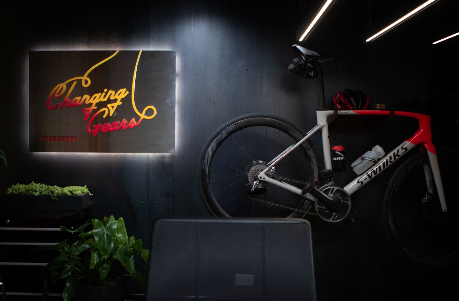
Journey Together with IZIP BikesIZIP was one of the first e-bike manufacturers 15 years ago, but with the market now flooded by competitors, they needed a way to stand out. We partnered with them to reintroduce their brand with a fresh, joyful perspective. The goal was to remind audiences that riding an IZIP bike isn’t just practical transportation, it’s pure, unapologetic fun.
Deliverables 2:00 Hero Video
1:00 Hero Videos
0:15 Social Cuts
Services Creative development
Pre-Production
Production
Post-Production
https://www.youtube.com/watch?v=h7cz4FoREc0&ab_channel=IZIPBikes
Emotional Goal To inject childlike joy into everyday life. IZIP was crafted in California. Fun, sun and taking the scenic route were part of the brands DNA. The emotional goal was to remind adults that it's ok to play like a kid.
https://player.vimeo.com/video/747799895?title=0
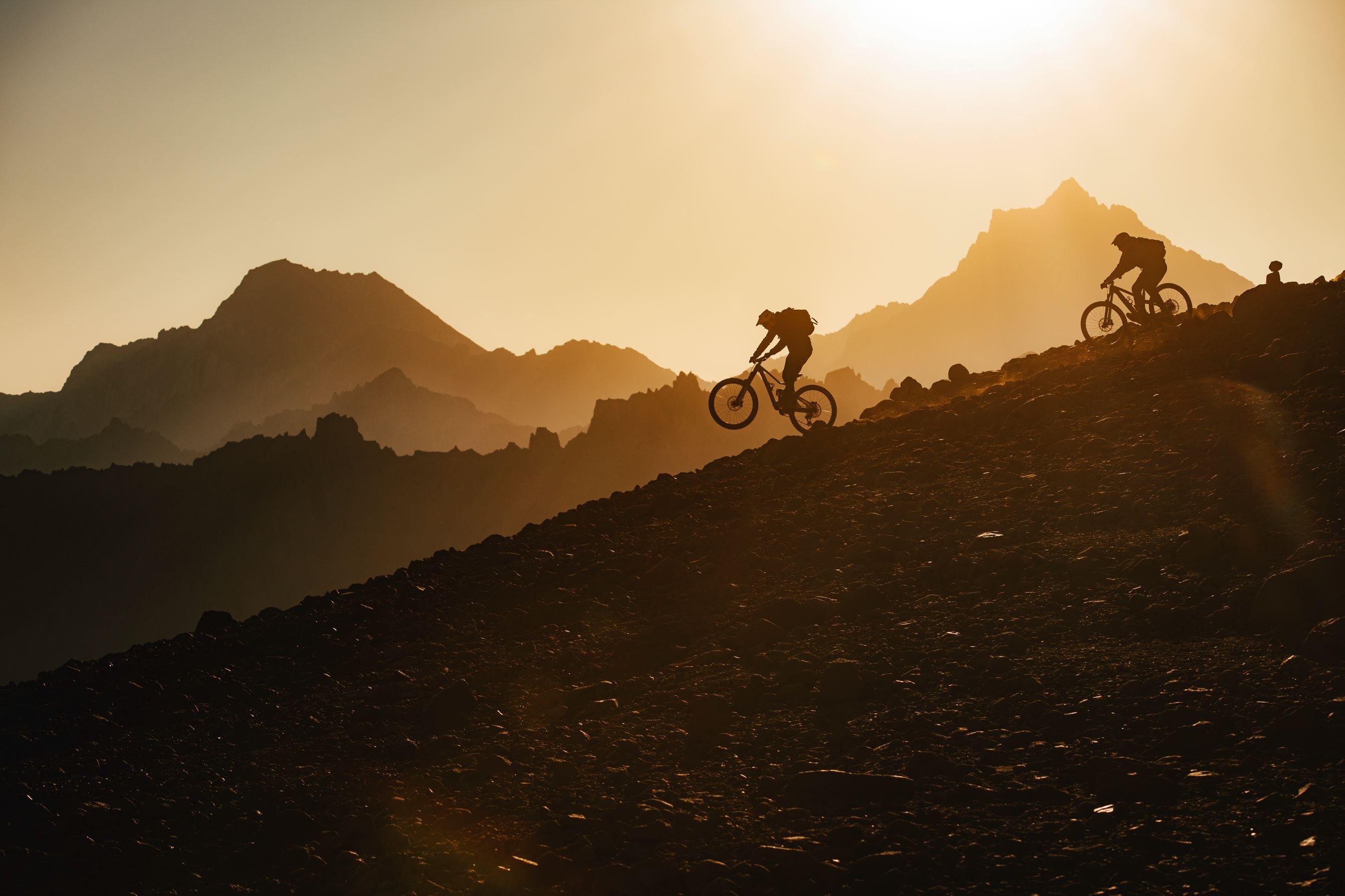
The Mission Electric bikes are everywhere, and many feel indistinguishable from one another. For IZIP, the challenge was more than standing out. It was about rekindling the emotional spark that first made people fall in love with biking. We identified an opportunity to speak directly to people overwhelmed by adult responsibilities and remind them that riding a bike can feel like being a kid again. The strategy was simple: make people smile, and they’ll want to ride.
The Approach Starting with IZIP’s existing campaign title, “Journey Together,” we built a script and visual world that leaned into bright, stylized storytelling. Inspired by the quirky tone of Wes Anderson films, we developed a playful narrative that celebrated the small, joyful moments of everyday adventure. Every element—from casting and wardrobe to set design and camera movement—was carefully crafted to feel vibrant, imaginative, and fun. The result was a film that felt less like a product ad and more like a charming, cinematic reminder that bikes make life better.
IMPACT This campaign helped IZIP launch a new phase for the business and establish their footprint in the electric bike industry.
Credits Directors: Line Producer: Shandi Kano1st AD: Bryan Russell
Latest More Projects @function torem($px){
@return calc($px / 16);
}
// a clamping function used for fluid values
@function fluid($fmin, $fmax, $vmin, $vmax){
$fminr: torem($fmin);
$fmaxr: torem($fmax);
$vminr: torem($vmin);
$vmaxr: torem($vmax);
$v: calc(100 * ($fmaxr - $fminr) / ($vmaxr - $vminr));
$r: calc( (($vminr * $fmaxr) - ($vmaxr * $fminr)) / ($vminr - $vmaxr) );
@return clamp(#{$fminr}rem, #{$v}vw + #{$r}rem, #{$fmaxr}rem);
}
$desk-max: 2600;
$desktop-upper: 1440;
$desktop-lower: 1080;
$tablet: 600;
$mobile: 300;
.cards{
@media (max-width:#{$desktop-lower}px){
.col-12{
margin-bottom:fluid(24,32, $desktop-lower, $desktop-upper);
}
.card{
grid-column:span 6;
&:nth-child(4){
grid-column:span 12;
width:100%;
.w-inline-block{
width:100%;
.card-img-wrap{
aspect-ratio:5/3;
width:calc(50% - var(--gap)/2);
img{
width:100%;
height:100%;
object-fit:cover;
}
}
display:flex;
flex-direction:row;
gap: var(--gap);
align-items:end;
}
}
}
}
@media (max-width:#{$tablet}px){
.card{
grid-column:span 12;
&:nth-child(4){
grid-column:span 12;
width:100%;
.w-inline-block{
width:100%;
.card-img-wrap{
aspect-ratio:1;
width:100%;
img{
width:100%;
height:100%;
object-fit:cover;
}
}
flex-direction:column;
gap:0;
align-items:start;
}
}
}
}
}
.card{
display:flex;
flex-direction:column;
gap:fluid(16, 12, $desktop-upper, $desktop-lower);
@media (max-width:#{$desktop-lower}px){
gap:0;
.dot-brow-gray{
margin-top:fluid(12,16, $desktop-lower, $desktop-upper);
}
}
.h4{
transition: color 300ms cubic-bezier(.3,0,0,1);
@media (max-width:#{$desktop-lower}px){
margin-top:#{torem(4)}px;
}
}
.card-img-wrap{
overflow:hidden;
border-radius:var(--radius);
aspect-ratio: 1;
}
img{
object-fit:cover;
width:100%;
height:100%;
object-fit:cover;
@media (max-width:#{$desktop-lower}px){
aspect-ratio:4/5;
}
will-change:transform;
transition: transform 300ms cubic-bezier(.3,0,0,1)
}
&:hover{
img{
transform: scale(1.1);
}
.dot-brow-gray:before{
background-color:var(--red);
}
.h4{
color:var(--white);
}
}
}


