@function torem($px){
@return calc($px / 16);
}
// a clamping function used for fluid values
@function fluid($fmin, $fmax, $vmin, $vmax){
$fminr: torem($fmin);
$fmaxr: torem($fmax);
$vminr: torem($vmin);
$vmaxr: torem($vmax);
$v: calc(100 * ($fmaxr - $fminr) / ($vmaxr - $vminr));
$r: calc( (($vminr * $fmaxr) - ($vmaxr * $fminr)) / ($vminr - $vmaxr) );
@return clamp(#{$fminr}rem, #{$v}vw + #{$r}rem, #{$fmaxr}rem);
}
$desk-max: 2600;
$desktop-upper: 1440;
$desktop-lower: 1080;
$tablet: 600;
$mobile: 300;
$mobile-open-width:70vw;
.navigation{
z-index:1000;
display:flex;
justify-content:space-between;
padding-top:16px;
position:absolute;
}
.nav-links{
position:fixed;
top:0;
right:0;
padding-top:16px;
margin:0;
display:flex;
align-items:end;
justify-content:end;
gap:2px;
z-index:1000;
width:fit-content;
}
.nav-link{
background:rgba(0,0,0,0.65);
position:relative;
border-radius:calc(var(--radius) / 2);
padding:4px 8px;
line-height:1;
font-size:#{torem(12)}rem;
letter-spacing:#{torem(.25)}rem;
transition:background 200ms cubic-bezier(0.3,0,0,1), color 200ms cubic-bezier(0.3,0,0,1), padding 200ms cubic-bezier(0.3,0,0,1);;
&:hover{
background:rgba(255,255,255,1);
color:var(--black);
}
}
.contact-link{
background:rgba(255,255,255,1);
color:var(--black);
position:relative;
display:flex;
align-items:center;
overflow:hidden;
&:before{
content:url('');
width:#{torem(4)}rem;
height:#{torem(4)}rem;
border-radius:1rem;
background-color:var(--red);
position:absolute;
left:-5px;
transition:left 200ms cubic-bezier(0.3,0,0,1);
}
&:hover{
padding-left:11px;
padding-right:5px;
&:before{
left:4px;
}
}
}
.burger{
display:none;
.w-embed{
display:flex;
}
@media (max-width:#{$desktop-lower}px){
display:flex;
}
top: 0;
position: relative;
align-items: center;
justify-content: center;
z-index: 100;
border: 1px solid var(--white);
width: 32px;
height: 32px;
border-radius: 8px;
}
#top, #center, #bottom{
transition: transform 300ms cubic-bezier(0.4,0,0,1);
}
.burger.open{
#top{
transform: rotateZ(45deg) translate(3px, 0px);
}
#center{
transform: scale(0);
}
#bottom{
transform: rotateZ(-45deg) translate(-5px, -2px);
}
}
.burger.open ~ .nav-links_clip{
width:$mobile-open-width;
height:100vh;
}
.hamb{
@media (max-width:#{$desktop-lower}px){
display:flex;
}
}
.nav-links_clip{
@media (max-width:#{$desktop-lower}px){
position:fixed;
height:100vh;
width:0vw;
right:0px;
top:0px;
overflow:hidden;
transition:width 300ms cubic-bezier(0.4,0,0,1);
}
}
.nav-links_wrap{
display:flex;
gap:2px;
transition: transform 300ms cubic-bezier(0.4,0,0,1);
@media (max-width: #{$desktop-lower}px){
flex-direction: column;
position: absolute;
width:$mobile-open-width;
top:0;
padding:16px;
padding-top:80px;
right:0;
background: rgba(0,0,0,.45);
backdrop-filter:blur(12px);
height:100vh;
z-index:1000;
gap: fluid(8, 12, $tablet, $mobile);
.nav-link{
font-size: fluid(14, 16, $tablet, $mobile);
}
}
}
@function torem($px){
@return calc($px / 16);
}
// a clamping function used for fluid values
@function fluid($fmin, $fmax, $vmin, $vmax){
$fminr: torem($fmin);
$fmaxr: torem($fmax);
$vminr: torem($vmin);
$vmaxr: torem($vmax);
$v: calc(100 * ($fmaxr - $fminr) / ($vmaxr - $vminr));
$r: calc( (($vminr * $fmaxr) - ($vmaxr * $fminr)) / ($vminr - $vmaxr) );
@return clamp(#{$fminr}rem, #{$v}vw + #{$r}rem, #{$fmaxr}rem);
}
$desk-max: 2600;
$desktop-upper: 1440;
$desktop-lower: 1080;
$tablet: 600;
$mobile: 300;
.cards{
@media (max-width:#{$desktop-lower}px){
.col-12{
margin-bottom:fluid(24,32, $desktop-lower, $desktop-upper);
}
.card{
grid-column:span 6;
&:nth-child(4){
grid-column:span 12;
width:100%;
.w-inline-block{
width:100%;
.card-img-wrap{
aspect-ratio:5/3;
width:calc(50% - var(--gap)/2);
img{
width:100%;
height:100%;
object-fit:cover;
}
}
display:flex;
flex-direction:row;
gap: var(--gap);
align-items:end;
}
}
}
}
@media (max-width:#{$tablet}px){
.card{
grid-column:span 12;
&:nth-child(4){
grid-column:span 12;
width:100%;
.w-inline-block{
width:100%;
.card-img-wrap{
aspect-ratio:1;
width:100%;
img{
width:100%;
height:100%;
object-fit:cover;
}
}
flex-direction:column;
gap:0;
align-items:start;
}
}
}
}
}
.card{
display:flex;
flex-direction:column;
gap:fluid(16, 12, $desktop-upper, $desktop-lower);
@media (max-width:#{$desktop-lower}px){
gap:0;
.dot-brow-gray{
margin-top:fluid(12,16, $desktop-lower, $desktop-upper);
}
}
.h4{
transition: color 300ms cubic-bezier(.3,0,0,1);
@media (max-width:#{$desktop-lower}px){
margin-top:#{torem(4)}px;
}
}
.card-img-wrap{
overflow:hidden;
border-radius:var(--radius);
aspect-ratio: 1;
}
img{
object-fit:cover;
width:100%;
height:100%;
object-fit:cover;
@media (max-width:#{$desktop-lower}px){
aspect-ratio:4/5;
}
will-change:transform;
transition: transform 300ms cubic-bezier(.3,0,0,1)
}
&:hover{
img{
transform: scale(1.1);
}
.dot-brow-gray:before{
background-color:var(--red);
}
.h4{
color:var(--white);
}
}
}
@use 'sass:math';
@function torem($px){
@return calc($px / 16);
}
html,body { padding:0; margin:0;}
// a clamping function used for fluid values
@function fluid($fmin, $fmax, $vmin, $vmax){
$fminr: torem($fmin);
$fmaxr: torem($fmax);
$vminr: torem($vmin);
$vmaxr: torem($vmax);
$v: calc(100 * ($fmaxr - $fminr) / ($vmaxr - $vminr));
$r: calc( (($vminr * $fmaxr) - ($vmaxr * $fminr)) / ($vminr - $vmaxr) );
@return clamp(#{$fminr}rem, #{$v}vw + #{$r}rem, #{$fmaxr}rem);
}
$desk-max: 2600;
$desktop-upper: 1440;
$desktop-lower: 1080;
$tablet: 600;
$mobile: 300;
section, nav{
width:100%;
display: grid;
padding-left: fluid(48, 64, $desktop-lower, $desktop-upper);
padding-right: fluid(48, 64, $desktop-lower, $desktop-upper);
position:relative;
}
.grid-padding-left{
padding-left: fluid(48, 64, $desktop-lower, $desktop-upper);
}
.grid-padding-right{
padding-right: fluid(48, 64, $desktop-lower, $desktop-upper);
}
.grid-padding{
padding-left: fluid(32, 48, $desktop-lower, $desktop-upper);
padding-right: fluid(32, 48, $desktop-lower, $desktop-upper);
}
@media (max-width:#{$tablet}px){
.grid-padding-left{
padding-left: fluid(20, 24, $mobile, $tablet);
}
.grid-padding-right{
padding-right: fluid(20, 24, $mobile, $tablet);
}
.grid-padding{
padding-left: fluid(20, 24, $mobile, $tablet);
padding-right: fluid(20, 24, $mobile, $tablet);
}
}
@media (max-width:#{$desktop-lower}px){
.grid-padding-left{
padding-left: 24px
}
.grid-padding-right{
padding-right: 24px;
}
.grid-padding{
padding-left: fluid(20, 24, $tablet, $desktop-lower);
padding-right: fluid(20, 24, $tablet, $desktop-lower);
}
}
//!------GRID DEFINITIONS------
//------
//grid is desktop first. mobile specific styling is defined with 'm_' and tablet with 't_'
//desktop
@media (min-width:#{($desktop-lower + 1)}px){
section, footer, nav{
width:100%;
padding-left:fluid(48, 64, $desktop-lower, $desktop-upper);
padding-right:fluid(48, 64, $desktop-lower, $desktop-upper);
display: grid;
gap: fluid(32, 48, $desktop-lower, $desktop-upper);
grid-template-columns: repeat(12, 1fr);
grid-auto-rows: auto;
}
@for $i from 1 through 12 {
.col-#{$i} {
grid-column: span #{$i};
}
}
.bleed-left{
margin-left: calc(fluid(48, 64, $desktop-lower, $desktop-upper) * -1);
padding-left:0;
}
.bleed-right{
margin-right: calc(fluid(48, 64, $desktop-lower, $desktop-upper) * -1);
padding-right:0;
}
}
//tablet
@media (max-width:#{$desktop-lower}px){
section, footer, nav{
width:100%;
padding-left: 24px;
padding-right: 24px;
display: grid;
gap: fluid(24, 32, $tablet, $desktop-lower);
grid-template-columns: repeat(12, 1fr);
grid-auto-rows: auto;
}
@for $i from 1 through 12 {
.col-#{$i} {
grid-column: span 12;
gap:var(--gap);
}
}
@for $i from 1 through 12 {
.t_col-#{$i} {
grid-column: span #{$i};
}
}
.bleed-left, .t_bleed-left{
margin-left:-#{torem(24)}rem;
padding-left:0;
}
.bleed-right, .t_bleed-right{
margin-right:-#{torem(24)}rem;
padding-right:0;
}
}
//mobile
@media (max-width:#{$tablet}px){
section, footer, .grid, nav{
width:100%;
padding-left: torem(20)+rem;
padding-right: torem(20)+rem;
display: grid;
gap: fluid(20, 24, $mobile, $tablet);
grid-template-columns: repeat(4, 1fr);
grid-auto-rows: auto;
}
@for $i from 1 through 12 {
.col-#{$i} {
grid-column: span 4;
}
@for $i from 1 through 12 {
.t_col-#{$i} {
grid-column: span #{math.round($i)};
}
}
@for $i from 1 through 12 {
.m_col-#{$i} {
grid-column: span #{$i};
}
}
}
.bleed-left, .t_bleed-left, .m_bleed-left{
margin-left:-#{torem(20)}rem;
padding-left:0;
}
.bleed-right, .t_bleed-right, .m_bleed-right{
margin-right:-#{torem(20)}rem;
padding-right:0;
}
@for $i from 1 through 12{
.sub-grid-#{i}{
display: grid;
width:100%;
grid-auto-rows: auto;
grid-template-columns: repeat(#{$i}, 1fr);
gap:var(--gap);
}
}
}
@for $i from 1 through 12{
.sub-grid-#{$i}{
display: grid;
width:100%;
grid-auto-rows: auto;
grid-template-columns: repeat(#{$i}, 1fr);
gap:var(--gap);
}
}
.home nav{
.link-home{
width:45%;
img{
width:100%;
}
}
.nav-home{
width:100%;
}
}
nav{
.col-6:last-child{
justify-self: end;
}
}
.grid-center{
align-items: center;
}
.flex-column{
display:flex;
flex-direction:column;
}
.t-hidden{
@media(max-width:#{$desktop-lower}px){
display:none;
}
}
.m-hidden{
@media(max-width:#{$tablet}px){
display:none;
}
}
.rich-text{
div{
margin:0;
}
}
@mixin write-spacing($metric, $val-1, $val-2, $val-3, $val-4){
$top: true;
$direction: top;
@for $i from 1 through 2{
@if $top{
$direction: top
} @else{
$direction: bottom;
}
.#{$metric}-#{$direction} {
@media screen and (min-width: #{$mobile}px) {
padding-#{$direction}: #{fluid($val-4, $val-3, $mobile, $tablet)};
}
@media screen and (min-width: #{$tablet}px) {
padding-#{$direction}: #{fluid($val-3, $val-2, $tablet, $desktop-lower)};
}
@media screen and (min-width: #{$desktop-lower}px) {
padding-#{$direction}: #{fluid($val-2, $val-1, $desktop-lower, $desktop-upper)};
}
$top: false;
}
}
.spacer-#{$metric}{
height: #{fluid($val-4, $val-3, $desktop-lower, $desktop-upper)};
position: relative;
display: block;
}
}
@include write-spacing(macro-1, 144, 120, 104, 64);
@include write-spacing(macro-2, 120, 104, 88, 56);
@include write-spacing(macro-3, 96, 80, 31, 32);
@include write-spacing(macro-4, 120, 96, 64, 32);
@include write-spacing(macro-5, 96, 72, 56, 24);
@include write-spacing(macro-6, 64, 56, 48, 24);
@include write-spacing(micro-1, 32, 28, 24, 20);
@include write-spacing(micro-2, 28, 24, 20, 16);
@include write-spacing(micro-3, 20, 16, 12, 8);
@include write-spacing(micro-4, 12, 8, 8, 8);
@function torem($px){
@return calc($px / 16);
}
// a clamping function used for fluid values
@function fluid($fmin, $fmax, $vmin, $vmax){
$fminr: torem($fmin);
$fmaxr: torem($fmax);
$vminr: torem($vmin);
$vmaxr: torem($vmax);
$v: calc(100 * ($fmaxr - $fminr) / ($vmaxr - $vminr));
$r: calc( (($vminr * $fmaxr) - ($vmaxr * $fminr)) / ($vminr - $vmaxr) );
@return clamp(#{$fminr}rem, #{$v}vw + #{$r}rem, #{$fmaxr}rem);
}
$desk-max: 2600;
$desktop-upper: 1920;
$desktop-lower: 1080;
$tablet: 600;
$mobile: 300;
*{
font-family: neue-haas-grotesk-text, helvetica, arial, sans-serif;
font-smooth: always;
-webkit-font-smoothing:antialiased;
-moz-osx-font-smoothing:grayscale;
}
@for $i from 1 through 6{
.h#{$i}, h#{$i}{
font-family: neue-haas-grotesk-display, helvetica, arial, sans-serif;
font-weight:450;
strong{
font-family: neue-haas-grotesk-display, helvetica, arial, sans-serif;
font-weight:450;
}
}
}
.text-white{
color:var(--white);
}
.text-center{
text-align:center;
}
strong, b{
font-weight:normal;
color:var(--white);
}
.h1{
font-size: fluid( 64, 72, $desktop-lower, $desktop-upper) !important;
margin:0;
line-height: 1;
text-wrap:balance;
@media (max-width:#{$tablet}px){
font-size: fluid( 40, 56, $mobile, $tablet) !important;
line-height: 1.1;
}
@media (max-width:#{$desktop-lower}px){
font-size: fluid( 36, 42, $tablet, $desktop-lower) !important;
}
}
.h2{
font-size: fluid( 40, 48, $desktop-lower, $desktop-upper);
margin:0;
line-height:1.4;
text-wrap: balance;
@media (max-width:#{$desktop-lower}px){
font-size: fluid( 32, 40, $tablet, $desktop-lower) !important;
}
@media (max-width:#{$tablet}px){
font-size: fluid( 24, 32, $mobile, $tablet) !important;
line-height: 1.1;
}
}
.h3{
font-size: fluid( 28, 34, $desktop-lower, 1920) !important;
margin:0;
text-transform:none;
@media (max-width:#{$desktop-lower}px){
font-size: fluid( 26, 28, $tablet, $desktop-lower) !important;
}
@media (max-width:#{$tablet}px){
font-size: fluid( 24, 26, $mobile, $tablet) !important;
line-height: 1.1;
}
}
.h4{
font-size: fluid( 24, 28, $desktop-lower, 1920) !important;
font-weight: 450;
margin:0;
line-height:1.25;
text-transform:none;
@media (max-width:#{$desktop-lower}px){
font-size: fluid( 20, 24, $tablet, $desktop-lower) !important;
@media (max-width:#{$tablet}px){
font-size: #{torem(20)}rem;
}
}
}
.h5{
margin:0;
}
.h6{
font-size: fluid( 16, 16, $desktop-lower, $desktop-upper) !important;
font-weight: 400;
margin:0;
text-transform:uppercase;
letter-spacing:.8px;
@media (max-width:#{$desktop-lower}px){
font-size:fluid(14,16, $tablet, $desktop-lower);
}
@media(max-width:#{$tablet}px){
font-size:#{torem(14)}rem;
}
}
.dot-brow{
font-size: fluid( 16, 16, $desktop-lower, $desktop-upper) !important;
font-weight: 400;
margin:0;
text-transform:uppercase;
letter-spacing:.8px;
&:before{
content:url();
background-color:var(--red);
width: #{torem(6)}rem;
height: #{torem(6)}rem;
border-radius:#{torem(12)}rem;
display:block;
}
display:flex;
align-items:center;
gap:#{torem(8)}rem;
}
.dot-brow-gray{
font-family: neue-haas-grotesk-display, helvetica, arial, sans-serif;
font-weight:450;
font-size: fluid( 14, 16, $desktop-lower, $desktop-upper) !important;
font-weight: 400;
margin:0;
text-transform:uppercase;
letter-spacing:.8px;
color: var(--text-gray);
&:before{
content:url();
background-color:var(--text-gray);
width: #{torem(6)}rem;
height: #{torem(6)}rem;
border-radius:#{torem(12)}rem;
display:block;
}
display:flex;
align-items:center;
gap:#{torem(8)}rem;
}
.p1{
font-size: fluid( 18, 20, $desktop-lower, $desktop-upper);
margin:0;
line-height:1.5;
@media (max-width:#{$desktop-lower}px){
font-size: #{torem(16)}rem;
}
@media (max-width:#{$tablet}px){
font-size: #{torem(16)}rem;
}
}
.legal{
font-size:#{torem(14)}rem;
letter-spacing:#{torem(1)}rem;
text-transform:uppercase;
color:var(--text-gray);
a{
color: var(--text-gray);
text-decoration:none;
transition:color 250ms cubic-bezier(.3,0,0,1);
&:hover{
color:var(--white);
}
}
@media (max-width:#{$desktop-lower}px){
font-size:fluid(12,14,$tablet,$desktop-lower)
}
@media (max-width:#{$tablet}px){
font-size:fluid(10,12,$mobile,$tablet)
}
}
.quote{
font-size: fluid( 40, 64, $desktop-lower, $desktop-upper);
margin:0;
line-height:1.25;
@media (max-width:#{$desktop-lower}px){
font-size: fluid( 36, 40, $tablet, $desktop-lower);
}
@media (max-width:#{$tablet}px){
font-size: fluid( 32, 36, $mobile, $tablet);
}
}
.quote-serif{
font-family:ppeiko, times, serif;
font-style:italic;
}
.button{
font-size: fluid(18, 20, $desktop-lower, $desktop-upper);
@media (max-width:#{$desktop-lower}px){
font-size: fluid( 16, 18, $tablet, $desktop-lower);
}
@media (max-width:#{$tablet}px){
font-size: 1rem;
}
}
.text-field-label{
position:relative;
top:0;
left:0;
font-weight:normal;
line-height:1;
font-size:#{torem(12)}rem;
text-transform:uppercase;
letter-spacing:#{torem(.25)}rem;
}
.h1 + .p1{
margin-top:.5rem;
}
.h2 + .p1{
margin-top:fluid(12,8, $desktop-lower, $desktop-upper);
}
.h3 + .p1{
margin-top:fluid(8, 6, $desktop-lower, $desktop-upper);
}
.h5-list{
.p1 + .h5{
margin-top:8px;
}
}
.dot-brow + h3{
margin-top:fluid(16,20,$desktop-lower,$desktop-upper);
}
.dot-brow + .h1{
margin-top:fluid(16,20,$desktop-lower,$desktop-upper);
}
.h6 + .h1{
margin-top:fluid(16,20,$desktop-lower,$desktop-upper);
}
.h6 + .p1, .dot-brow + .p1{
margin-top: fluid(16, 24, $desktop-lower, $desktop-upper);
@media(max-width:#{$desktop-lower}px){
margin-top:(8,16, $tablet, $desktop-lower)
}
@media(max-width:#{$tablet}px){
margin-top:.5rem;
}
}
.p1 + .button, .p1 + .button-group{
margin-top: fluid(24, 32, $desktop-lower, $desktop-upper);
}
.rich-text + .button, .rich-text + .button-outline, .rich-text + .button-group{
margin-top:fluid(32,40,$desktop-lower, $desktop-upper);
} body{
background: var(--black);
color: var(--white);
}
.sticky{
position:sticky;
}
.section-last{
background: var(--black);
position:relative;
z-index:2;
}
.rounded{
border-radius:var(--radius);
}
.flex-between-vertical{
display:flex;
flex-direction:column;
justify-content:space-between;
height:100%;
}
.row-gap-none{
row-gap:0;
}
.product-card{
.product-card_content{
display:flex;
flex-direction:column;
gap:1rem;
}
@media (max-width:1080px){
flex-direction:row;
.product-card-image, .product-card-content{
width:50%;
}
}
@media (max-width:600px){
flex-direction:column;
.product-card-image, .product-card-content{
width:100%;
}
}
}
.t-hidden{
@media (max-width:1080px){
display:none;
}
}
.w-button{
font-family:inherit;
padding:0;
pointer-events:auto;
}
input[type=submit]{
transition: padding 200ms cubic-bezier(0.4,0,0,1);
}
.button-wrapper {
pointer-events: none;
border-radius:8px;
overflow:hidden;
&:before{
top:7.5px;
}
&:hover{
background-color:var(--_colors---black);
input{
padding-left:32px;
padding-right:12px;
}
padding:0;
}
}
.submit-button{
padding:8px 22px;
}
.button-outline, .button-reverse{
&::before{
content:url(https://cdn.prod.website-files.com/6780a187f1bff60a0924e333/6792feeda5be3c6114392385_arrow-right.svg)
}
}
.balance-wrap{
text-wrap:balance;
}
.sub-hero{
.h2, .quote{
text-wrap: balance;
}
}
.display-none{
display:none;
}
.live-hide{
display:none;
}
.video-link{
display:none;
}
.editor{
.video-link{
display:block;
}
.live-hide{
display:block;
}
}
.inline-video{
.video-embed{
width:100%;
border-radius:var(--radius);
aspect-ratio: 16/9;
}
}
.ball{
width:8px;
height:8px;
border-radius:9000px;
background:var(--red);
z-index:1111;
position:fixed;
display:none;
pointer-events: none;
} .gray{
color:var(--text-gray);
}
.white{
color:var(--white);
}
.black{
color:var(--black);
} @function torem($px){
@return calc($px / 16);
}
// a clamping function used for fluid values
@function fluid($fmin, $fmax, $vmin, $vmax){
$fminr: torem($fmin);
$fmaxr: torem($fmax);
$vminr: torem($vmin);
$vmaxr: torem($vmax);
$v: calc(100 * ($fmaxr - $fminr) / ($vmaxr - $vminr));
$r: calc( (($vminr * $fmaxr) - ($vmaxr * $fminr)) / ($vminr - $vmaxr) );
@return clamp(#{$fminr}rem, #{$v}vw + #{$r}rem, #{$fmaxr}rem);
}
$desk-max: 2600;
$desktop-upper: 1920;
$desktop-lower: 1080;
$tablet: 600;
$mobile: 300;
.button, .button-outline, .button-reverse, .button-wrapper{
transition: padding 200ms cubic-bezier(0.3,0,0,1);
will-change: padding;
position:relative;
display:block;
overflow:hidden;
width:fit-content;
border-radius: var(--radius);
padding: #{torem(12)}rem #{torem(24)}rem;
text-transform: uppercase;
font-size:#{torem(12)}rem;
line-height:1;
&::before{
content:url();
position:absolute;
left:-14px;
top: #{torem(14)}rem;
width:#{torem(8)}rem;
height:#{torem(8)}rem;
border-radius:100px;
background: var(--red);
transition: transform 200ms cubic-bezier(0.3,0,0,1);
}
&:hover{
padding-left:#{torem(32)}rem;
padding-right:#{torem(16)}rem;
&:before{
transform: translateX(#{torem(28)}rem);
}
}
}
.button{
background:var(--white);
color:var(--black);
border:none;
}
.button-outline{
color:var(--white);
border:1px solid var(--white);
}
.button-group{
display:flex;
gap: fluid(24, 32, $desktop-lower, $desktop-upper);
flex-wrap:wrap;
}
@use 'sass:math';
@function torem($px){
@return calc($px / 16);
}
// a clamping function used for fluid values
@function fluid($fmin, $fmax, $vmin, $vmax){
$fminr: torem($fmin);
$fmaxr: torem($fmax);
$vminr: torem($vmin);
$vmaxr: torem($vmax);
$v: calc(100 * ($fmaxr - $fminr) / ($vmaxr - $vminr));
$r: calc( (($vminr * $fmaxr) - ($vmaxr * $fminr)) / ($vminr - $vmaxr) );
@return clamp(#{$fminr}rem, #{$v}vw + #{$r}rem, #{$fmaxr}rem);
}
$desk-max: 2600;
$desktop-upper: 1440;
$desktop-lower: 1080;
$tablet: 600;
$mobile: 300;
$center: 764px;
.rich-text-blog *{
max-width:$center;
margin: 0px auto;
}
.rich-text-blog{
.w-richtext-figure-type-video{
margin-top: fluid(56, 72, $desktop-lower, $desktop-upper);
margin-bottom: fluid(56, 72, $desktop-lower, $desktop-upper);
}
w-richtext-figure-type-image{
margin-top: fluid(72, 96, $desktop-lower, $desktop-upper);
margin-bottom: fluid(72, 96, $desktop-lower, $desktop-upper);
}
.w-richtext-align-fullwidth, .w-richtext-figure-type-video{
max-width:100%;
img{
max-width:none;
}
iframe{
max-width:none;
}
div{
max-width:none;
}
}
.w-richtext-align-center{
max-width: $center;
div, img{
max-width: none;
}
}
p{
color: var(--text-gray);
}
a{
color: var(--white);
text-decoration:underline;
text-decoration-thickness:#{torem(1.5)}rem !important;
transition:color 250ms cubic-bezier(0.3,0,0,1);
&:hover{
color:var(--text-gray);
}
}
ol,ul{
color: var(--text-gray);
li{
margin:0;
}
}
strong, b{
font-weight:400;
color: var(--white);
}
blockquote{
max-width: 900px;
border:none;
padding:0;
font-size: fluid( 20, 28, $desktop-lower, $desktop-upper);
margin:0;
line-height:1.5;
@media (max-width:#{$desktop-lower}px){
font-size: fluid(16, 18, $desktop-lower, $desktop-upper);
}
@media (max-width:#{$tablet}px){
font-size: #{torem(16)}rem;
}
}
figcaption{
text-align:left;
width:100%;
color:var(--text-gray);
margin-top:#{torem(4)}rem;
max-width:none;
}
h1{
font-size: fluid( 64, 72, $desktop-lower, $desktop-upper) !important;
line-height: 1;
text-wrap:balance;
@media (max-width:#{$tablet}px){
font-size: fluid( 40, 56, $mobile, $tablet) !important;
line-height: 1.1;
}
@media (max-width:#{$desktop-lower}px){
font-size: fluid( 56, 64, $tablet, $desktop-lower) !important;
}
}
h2{
font-size: fluid( 40, 48, $desktop-lower, $desktop-upper);
line-height:1;
text-wrap: balance;
@media (max-width:#{$desktop-lower}px){
font-size: fluid( 32, 40, $tablet, $desktop-lower) !important;
}
@media (max-width:#{$tablet}px){
font-size: fluid( 24, 32, $mobile, $tablet) !important;
line-height: 1.1;
}
}
h3{
font-size: fluid( 28, 34, $desktop-lower, 1920) !important;
text-transform:none;
@media (max-width:#{$desktop-lower}px){
font-size: fluid( 24, 28, $tablet, $desktop-lower) !important;
}
@media (max-width:#{$tablet}px){
font-size: fluid( 20, 24, $mobile, $tablet) !important;
line-height: 1.1;
}
}
h4{
font-size: fluid( 24, 28, $desktop-lower, 1920) !important;
font-weight: 450;
line-height:1.25;
text-transform:none;
@media (max-width:#{$desktop-lower}px){
font-size: fluid( 24, 32, $tablet, $desktop-lower) !important;
@media (max-width:#{$tablet}px){
font-size: #{torem(20)}rem;
}
}
}
h5{
}
h6{
font-size: fluid(16, 16, $desktop-lower, $desktop-upper) !important;
font-weight: 400;
text-transform:uppercase;
letter-spacing:.8px;
}
ul,ol{
justify-content:start;
}
li{
font-size: fluid(18, 20, $desktop-lower, $desktop-upper);
}
p1{
font-size: fluid( 18, 20, $desktop-lower, $desktop-upper);
margin:0;
line-height:1.5;
@media (max-width:#{$desktop-lower}px){
font-size: fluid(16, 18, $desktop-lower, $desktop-upper);
}
@media (max-width:#{$tablet}px){
font-size: #{torem(16)}rem;
}
}
h1 + p{
margin-top:1rem;
}
h2 + p{
margin-top:1rem;
}
h3 + p{
margin-top: .75rem;
}
h2 + p{
margin-top: 1rem;
}
h3 + ul, h3 + ol{
margin-top: .5rem;
}
h4 + p{
margin-top: .5rem;
}
h5+ul, h5+ol{
margin-top:fluid(8, 16, $desktop-lower, $desktop-upper)
}
blockquote + blockquote{
margin-top: fluid(56, 72, $desktop-lower, $desktop-upper);
}
blockquote + p{
margin-top: fluid(64, 72, $desktop-lower, $desktop-upper);
}
p + h2{
margin-top:4rem;
}
p + h3{
margin-top:3rem;
}
p + h4{
margin-top: fluid(40, 48, $desktop-lower, $desktop-upper)
}
p+h5{
margin-top: fluid( 18*1.5, 20*1.5, $desktop-lower, $desktop-upper);
}
p + blockquote{
margin-top: fluid(64, 72, $desktop-lower, $desktop-upper);
}
p + p {
margin-top: fluid( 18*1.5, 20*1.5, $desktop-lower, $desktop-upper);
}
ol + h3, ul + h3{
margin-top: fluid(64, 72, $desktop-lower, $desktop-upper);
}
ol + h4, ul + h4{
margin-top: fluid(64, 72, $desktop-lower, $desktop-upper);
}
ol+h5, ul+h5{
margin-top: fluid(24, 32, $desktop-lower, $desktop-upper);
}
p + ul, p + ol{
margin-top: fluid(12, 16, $desktop-lower, $desktop-upper);
}
ul + p, ol + p{
margin-top: fluid(24, 32, $desktop-lower, $desktop-upper);
}
ul + p{}
ol li::marker{
color: var(--white);
text-align:left;
}
figure{
margin-top:fluid(56,80, $desktop-lower, $desktop-upper);
margin-bottom:fluid(56,72, $desktop-lower, $desktop-upper);
}
}
Every year, brands invest millions of dollars creating content, running ads, sponsoring athletes, launching campaigns, and trying to earn a place in consumers' minds. Yet despite all of that effort, much of the industry still feels remarkably similar. Scroll through social media and you'll see the same beautiful landscapes, the same athlete stories, the same product launches, and the same messaging repeated over and over again.
At the same time, the forces working against brands continue to grow. Customer acquisition costs are rising. Consumers are exposed to more marketing than ever before. Attention is fragmented across countless platforms, creators, and channels. And while brands have more ways to reach people than ever before, actually earning attention has become increasingly difficult.
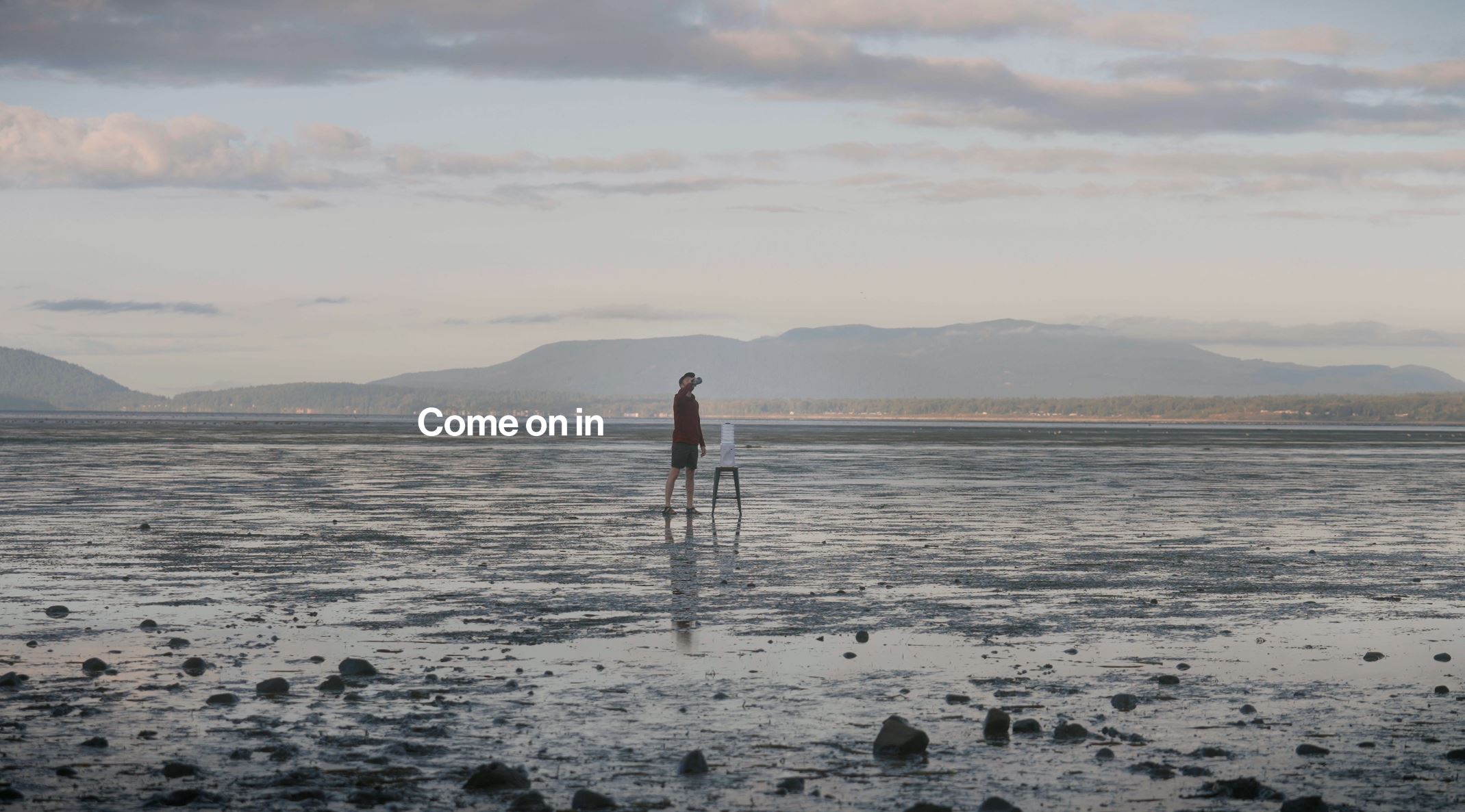
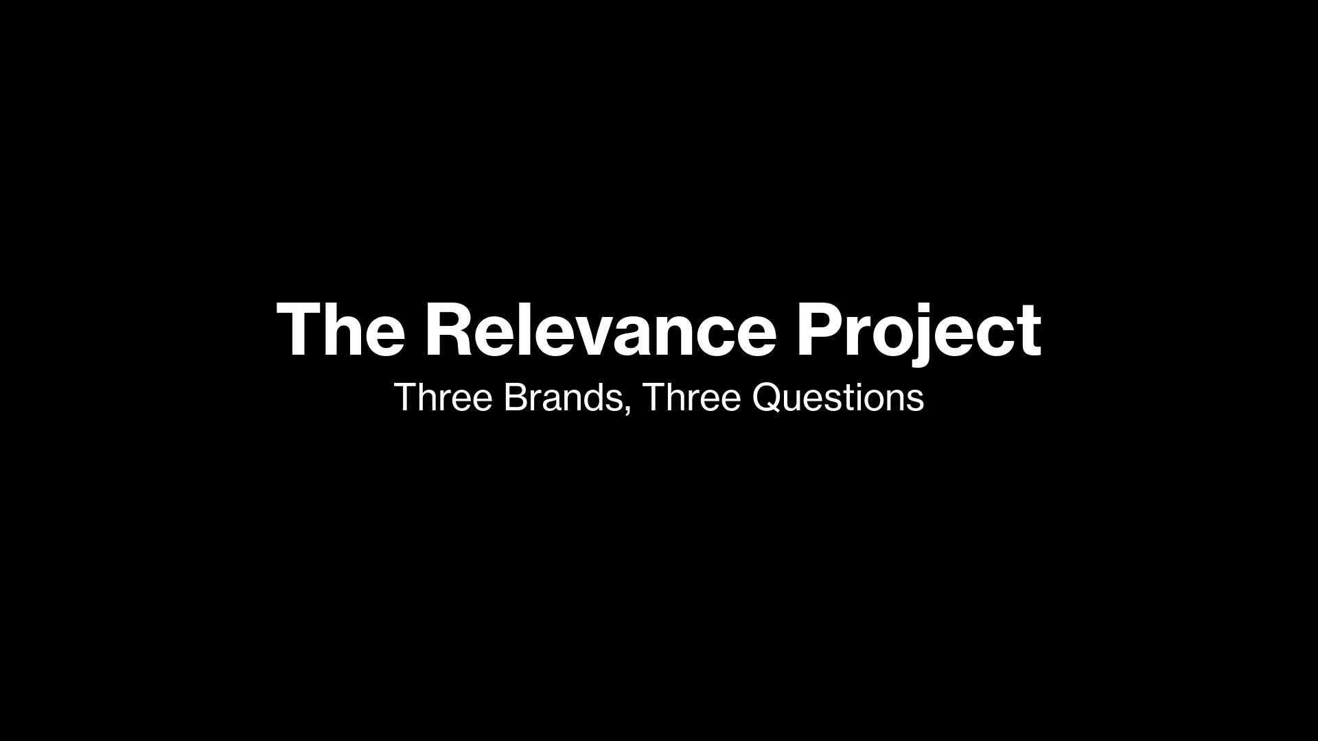
After years of asking ourselves questions like, What would happen if brands focused on creating entertainment and producign contet the audience actually cared about? —and finding very few brands willing to trust us enough to test the idea—Port Side decided to launch a public experiment.
Over the next three months, we'll partner with three brands, document the entire process on the podcast, and set out to answer three fundamental questions. Along the way, we'll share what we're learning, report on the results, and continue bringing in experts to challenge our thinking and help us find the answers.
The Questions These are the questions we hope to answer.
Can a brand that consistently creates audience-first content reduce its reliance on paid media while maintaining or improving customer acquisition efficiency? What measurable signals indicate that building an owned audience is creating future demand? Can consistently creating high-attention content increase a brand's share of voice, and does that growth correlate with stronger business outcomes over time?
The Business Case Several forces are converging that make this an interesting time to test a different approach.
Research from the Ehrenberg-Bass Institute suggests that roughly 95% of buyers are not actively in-market at any given time. Yet much of modern marketing is designed to capture demand from the small percentage of people who are ready to buy today.
Meanwhile:
Customer acquisition costs continue to rise. Consumers are exposed to thousands of marketing messages every day. Trust has become one of the strongest drivers of purchasing decisions. Social media has dramatically lowered the barrier to content creation, resulting in a sea of sameness. Many outdoor categories have limited product differentiation, making brand one of the few remaining competitive advantages. Attention is increasingly fragmented across platforms, creators, and channels. Taken together, these forces create a difficult challenge.
How does a brand stay memorable in a world where consumers are overwhelmed and competitors are only a click away?
Our hypothesis is that brands that consistently earn attention through relevant, audience-first content can increase mental availability, build stronger audience relationships, and ultimately create more efficient business growth.
VIDEO
The Format: Over the next three months, Port Side will partner with three outdoor brands from different backgrounds and categories. Together, we'll identify what makes each brand unique, develop audience-first content strategies, create content, distribute it, and measure the results. The goal isn't to create another polished case study after the fact, the goal is to document the process in real time and be published on The Backcountry Marketing Podcast
What We're Tracking One of the biggest challenges with brand-building efforts is measurement. Revenue often lags behind attention, making it difficult to understand whether progress is being made.
To address this, we'll track both leading and lagging indicators.
Leading Indicators These metrics help us understand whether we're earning attention and building memory.
Reach Video completion rates Shares Saves Audience growth Branded search volume Direct website traffic Post purchase surveys Lagging Indicators These metrics help us understand whether those efforts are translating into business outcomes.
Customer acquisition cost (CAC) Marketing efficiency ratio (MER) Revenue growth Why We're Doing This As filmmakers, strategists, and marketers, we've spent years helping brands tell stories. Along the way, we've become increasingly interested in a question that seems to sit at the center of modern marketing: If attention is one of the most valuable resources a brand can earn, what happens when a company consistently creates content that people genuinely want to consume? The Relevance Project is our attempt to find out.
We don't know exactly what we'll discover, but we believe the answer could have important implications for how outdoor brands think about content, audience building, and growth in the years ahead.
Follow Along YouTube | Apple Podcast | Spotify | LinkedIn
Could your brand benefit from this type of work? We intend to take these findings and turn it into a service. Reach out if you want more info.