@function torem($px){
@return calc($px / 16);
}
// a clamping function used for fluid values
@function fluid($fmin, $fmax, $vmin, $vmax){
$fminr: torem($fmin);
$fmaxr: torem($fmax);
$vminr: torem($vmin);
$vmaxr: torem($vmax);
$v: calc(100 * ($fmaxr - $fminr) / ($vmaxr - $vminr));
$r: calc( (($vminr * $fmaxr) - ($vmaxr * $fminr)) / ($vminr - $vmaxr) );
@return clamp(#{$fminr}rem, #{$v}vw + #{$r}rem, #{$fmaxr}rem);
}
$desk-max: 2600;
$desktop-upper: 1440;
$desktop-lower: 1080;
$tablet: 600;
$mobile: 300;
$mobile-open-width:70vw;
.navigation{
z-index:1000;
display:flex;
justify-content:space-between;
padding-top:16px;
position:absolute;
}
.nav-links{
position:fixed;
top:0;
right:0;
padding-top:16px;
margin:0;
display:flex;
align-items:end;
justify-content:end;
gap:2px;
z-index:1000;
width:fit-content;
}
.nav-link{
background:rgba(0,0,0,0.65);
position:relative;
border-radius:calc(var(--radius) / 2);
padding:4px 8px;
line-height:1;
font-size:#{torem(12)}rem;
letter-spacing:#{torem(.25)}rem;
transition:background 200ms cubic-bezier(0.3,0,0,1), color 200ms cubic-bezier(0.3,0,0,1), padding 200ms cubic-bezier(0.3,0,0,1);;
&:hover{
background:rgba(255,255,255,1);
color:var(--black);
}
}
.contact-link{
background:rgba(255,255,255,1);
color:var(--black);
position:relative;
display:flex;
align-items:center;
overflow:hidden;
&:before{
content:url('');
width:#{torem(4)}rem;
height:#{torem(4)}rem;
border-radius:1rem;
background-color:var(--red);
position:absolute;
left:-5px;
transition:left 200ms cubic-bezier(0.3,0,0,1);
}
&:hover{
padding-left:11px;
padding-right:5px;
&:before{
left:4px;
}
}
}
.burger{
display:none;
.w-embed{
display:flex;
}
@media (max-width:#{$desktop-lower}px){
display:flex;
}
top: 0;
position: relative;
align-items: center;
justify-content: center;
z-index: 100;
border: 1px solid var(--white);
width: 32px;
height: 32px;
border-radius: 8px;
}
#top, #center, #bottom{
transition: transform 300ms cubic-bezier(0.4,0,0,1);
}
.burger.open{
#top{
transform: rotateZ(45deg) translate(3px, 0px);
}
#center{
transform: scale(0);
}
#bottom{
transform: rotateZ(-45deg) translate(-5px, -2px);
}
}
.burger.open ~ .nav-links_clip{
width:$mobile-open-width;
height:100vh;
}
.hamb{
@media (max-width:#{$desktop-lower}px){
display:flex;
}
}
.nav-links_clip{
@media (max-width:#{$desktop-lower}px){
position:fixed;
height:100vh;
width:0vw;
right:0px;
top:0px;
overflow:hidden;
transition:width 300ms cubic-bezier(0.4,0,0,1);
}
}
.nav-links_wrap{
display:flex;
gap:2px;
transition: transform 300ms cubic-bezier(0.4,0,0,1);
@media (max-width: #{$desktop-lower}px){
flex-direction: column;
position: absolute;
width:$mobile-open-width;
top:0;
padding:16px;
padding-top:80px;
right:0;
background: rgba(0,0,0,.45);
backdrop-filter:blur(12px);
height:100vh;
z-index:1000;
gap: fluid(8, 12, $tablet, $mobile);
.nav-link{
font-size: fluid(14, 16, $tablet, $mobile);
}
}
}
@use 'sass:math';
@function torem($px){
@return calc($px / 16);
}
html,body { padding:0; margin:0;}
// a clamping function used for fluid values
@function fluid($fmin, $fmax, $vmin, $vmax){
$fminr: torem($fmin);
$fmaxr: torem($fmax);
$vminr: torem($vmin);
$vmaxr: torem($vmax);
$v: calc(100 * ($fmaxr - $fminr) / ($vmaxr - $vminr));
$r: calc( (($vminr * $fmaxr) - ($vmaxr * $fminr)) / ($vminr - $vmaxr) );
@return clamp(#{$fminr}rem, #{$v}vw + #{$r}rem, #{$fmaxr}rem);
}
$desk-max: 2600;
$desktop-upper: 1440;
$desktop-lower: 1080;
$tablet: 600;
$mobile: 300;
section, nav{
width:100%;
display: grid;
padding-left: fluid(48, 64, $desktop-lower, $desktop-upper);
padding-right: fluid(48, 64, $desktop-lower, $desktop-upper);
position:relative;
}
.grid-padding-left{
padding-left: fluid(48, 64, $desktop-lower, $desktop-upper);
}
.grid-padding-right{
padding-right: fluid(48, 64, $desktop-lower, $desktop-upper);
}
.grid-padding{
padding-left: fluid(32, 48, $desktop-lower, $desktop-upper);
padding-right: fluid(32, 48, $desktop-lower, $desktop-upper);
}
@media (max-width:#{$tablet}px){
.grid-padding-left{
padding-left: fluid(20, 24, $mobile, $tablet);
}
.grid-padding-right{
padding-right: fluid(20, 24, $mobile, $tablet);
}
.grid-padding{
padding-left: fluid(20, 24, $mobile, $tablet);
padding-right: fluid(20, 24, $mobile, $tablet);
}
}
@media (max-width:#{$desktop-lower}px){
.grid-padding-left{
padding-left: 24px
}
.grid-padding-right{
padding-right: 24px;
}
.grid-padding{
padding-left: fluid(20, 24, $tablet, $desktop-lower);
padding-right: fluid(20, 24, $tablet, $desktop-lower);
}
}
//!------GRID DEFINITIONS------
//------
//grid is desktop first. mobile specific styling is defined with 'm_' and tablet with 't_'
//desktop
@media (min-width:#{($desktop-lower + 1)}px){
section, footer, nav{
width:100%;
padding-left:fluid(48, 64, $desktop-lower, $desktop-upper);
padding-right:fluid(48, 64, $desktop-lower, $desktop-upper);
display: grid;
gap: fluid(32, 48, $desktop-lower, $desktop-upper);
grid-template-columns: repeat(12, 1fr);
grid-auto-rows: auto;
}
@for $i from 1 through 12 {
.col-#{$i} {
grid-column: span #{$i};
}
}
.bleed-left{
margin-left: calc(fluid(48, 64, $desktop-lower, $desktop-upper) * -1);
padding-left:0;
}
.bleed-right{
margin-right: calc(fluid(48, 64, $desktop-lower, $desktop-upper) * -1);
padding-right:0;
}
}
//tablet
@media (max-width:#{$desktop-lower}px){
section, footer, nav{
width:100%;
padding-left: 24px;
padding-right: 24px;
display: grid;
gap: fluid(24, 32, $tablet, $desktop-lower);
grid-template-columns: repeat(12, 1fr);
grid-auto-rows: auto;
}
@for $i from 1 through 12 {
.col-#{$i} {
grid-column: span 12;
gap:var(--gap);
}
}
@for $i from 1 through 12 {
.t_col-#{$i} {
grid-column: span #{$i};
}
}
.bleed-left, .t_bleed-left{
margin-left:-#{torem(24)}rem;
padding-left:0;
}
.bleed-right, .t_bleed-right{
margin-right:-#{torem(24)}rem;
padding-right:0;
}
}
//mobile
@media (max-width:#{$tablet}px){
section, footer, .grid, nav{
width:100%;
padding-left: torem(20)+rem;
padding-right: torem(20)+rem;
display: grid;
gap: fluid(20, 24, $mobile, $tablet);
grid-template-columns: repeat(4, 1fr);
grid-auto-rows: auto;
}
@for $i from 1 through 12 {
.col-#{$i} {
grid-column: span 4;
}
@for $i from 1 through 12 {
.t_col-#{$i} {
grid-column: span #{math.round($i)};
}
}
@for $i from 1 through 12 {
.m_col-#{$i} {
grid-column: span #{$i};
}
}
}
.bleed-left, .t_bleed-left, .m_bleed-left{
margin-left:-#{torem(20)}rem;
padding-left:0;
}
.bleed-right, .t_bleed-right, .m_bleed-right{
margin-right:-#{torem(20)}rem;
padding-right:0;
}
@for $i from 1 through 12{
.sub-grid-#{i}{
display: grid;
width:100%;
grid-auto-rows: auto;
grid-template-columns: repeat(#{$i}, 1fr);
gap:var(--gap);
}
}
}
@for $i from 1 through 12{
.sub-grid-#{$i}{
display: grid;
width:100%;
grid-auto-rows: auto;
grid-template-columns: repeat(#{$i}, 1fr);
gap:var(--gap);
}
}
.home nav{
.link-home{
width:45%;
img{
width:100%;
}
}
.nav-home{
width:100%;
}
}
nav{
.col-6:last-child{
justify-self: end;
}
}
.grid-center{
align-items: center;
}
.flex-column{
display:flex;
flex-direction:column;
}
.t-hidden{
@media(max-width:#{$desktop-lower}px){
display:none;
}
}
.m-hidden{
@media(max-width:#{$tablet}px){
display:none;
}
}
.rich-text{
div{
margin:0;
}
}
@mixin write-spacing($metric, $val-1, $val-2, $val-3, $val-4){
$top: true;
$direction: top;
@for $i from 1 through 2{
@if $top{
$direction: top
} @else{
$direction: bottom;
}
.#{$metric}-#{$direction} {
@media screen and (min-width: #{$mobile}px) {
padding-#{$direction}: #{fluid($val-4, $val-3, $mobile, $tablet)};
}
@media screen and (min-width: #{$tablet}px) {
padding-#{$direction}: #{fluid($val-3, $val-2, $tablet, $desktop-lower)};
}
@media screen and (min-width: #{$desktop-lower}px) {
padding-#{$direction}: #{fluid($val-2, $val-1, $desktop-lower, $desktop-upper)};
}
$top: false;
}
}
.spacer-#{$metric}{
height: #{fluid($val-4, $val-3, $desktop-lower, $desktop-upper)};
position: relative;
display: block;
}
}
@include write-spacing(macro-1, 144, 120, 104, 64);
@include write-spacing(macro-2, 120, 104, 88, 56);
@include write-spacing(macro-3, 96, 80, 31, 32);
@include write-spacing(macro-4, 120, 96, 64, 32);
@include write-spacing(macro-5, 96, 72, 56, 24);
@include write-spacing(macro-6, 64, 56, 48, 24);
@include write-spacing(micro-1, 32, 28, 24, 20);
@include write-spacing(micro-2, 28, 24, 20, 16);
@include write-spacing(micro-3, 20, 16, 12, 8);
@include write-spacing(micro-4, 12, 8, 8, 8);
@function torem($px){
@return calc($px / 16);
}
// a clamping function used for fluid values
@function fluid($fmin, $fmax, $vmin, $vmax){
$fminr: torem($fmin);
$fmaxr: torem($fmax);
$vminr: torem($vmin);
$vmaxr: torem($vmax);
$v: calc(100 * ($fmaxr - $fminr) / ($vmaxr - $vminr));
$r: calc( (($vminr * $fmaxr) - ($vmaxr * $fminr)) / ($vminr - $vmaxr) );
@return clamp(#{$fminr}rem, #{$v}vw + #{$r}rem, #{$fmaxr}rem);
}
$desk-max: 2600;
$desktop-upper: 1920;
$desktop-lower: 1080;
$tablet: 600;
$mobile: 300;
*{
font-family: neue-haas-grotesk-text, helvetica, arial, sans-serif;
font-smooth: always;
-webkit-font-smoothing:antialiased;
-moz-osx-font-smoothing:grayscale;
}
@for $i from 1 through 6{
.h#{$i}, h#{$i}{
font-family: neue-haas-grotesk-display, helvetica, arial, sans-serif;
font-weight:450;
strong{
font-family: neue-haas-grotesk-display, helvetica, arial, sans-serif;
font-weight:450;
}
}
}
.text-white{
color:var(--white);
}
.text-center{
text-align:center;
}
strong, b{
font-weight:normal;
color:var(--white);
}
.h1{
font-size: fluid( 64, 72, $desktop-lower, $desktop-upper) !important;
margin:0;
line-height: 1;
text-wrap:balance;
@media (max-width:#{$tablet}px){
font-size: fluid( 40, 56, $mobile, $tablet) !important;
line-height: 1.1;
}
@media (max-width:#{$desktop-lower}px){
font-size: fluid( 36, 42, $tablet, $desktop-lower) !important;
}
}
.h2{
font-size: fluid( 40, 48, $desktop-lower, $desktop-upper);
margin:0;
line-height:1.4;
text-wrap: balance;
@media (max-width:#{$desktop-lower}px){
font-size: fluid( 32, 40, $tablet, $desktop-lower) !important;
}
@media (max-width:#{$tablet}px){
font-size: fluid( 24, 32, $mobile, $tablet) !important;
line-height: 1.1;
}
}
.h3{
font-size: fluid( 28, 34, $desktop-lower, 1920) !important;
margin:0;
text-transform:none;
@media (max-width:#{$desktop-lower}px){
font-size: fluid( 26, 28, $tablet, $desktop-lower) !important;
}
@media (max-width:#{$tablet}px){
font-size: fluid( 24, 26, $mobile, $tablet) !important;
line-height: 1.1;
}
}
.h4{
font-size: fluid( 24, 28, $desktop-lower, 1920) !important;
font-weight: 450;
margin:0;
line-height:1.25;
text-transform:none;
@media (max-width:#{$desktop-lower}px){
font-size: fluid( 20, 24, $tablet, $desktop-lower) !important;
@media (max-width:#{$tablet}px){
font-size: #{torem(20)}rem;
}
}
}
.h5{
margin:0;
}
.h6{
font-size: fluid( 16, 16, $desktop-lower, $desktop-upper) !important;
font-weight: 400;
margin:0;
text-transform:uppercase;
letter-spacing:.8px;
@media (max-width:#{$desktop-lower}px){
font-size:fluid(14,16, $tablet, $desktop-lower);
}
@media(max-width:#{$tablet}px){
font-size:#{torem(14)}rem;
}
}
.dot-brow{
font-size: fluid( 16, 16, $desktop-lower, $desktop-upper) !important;
font-weight: 400;
margin:0;
text-transform:uppercase;
letter-spacing:.8px;
&:before{
content:url();
background-color:var(--red);
width: #{torem(6)}rem;
height: #{torem(6)}rem;
border-radius:#{torem(12)}rem;
display:block;
}
display:flex;
align-items:center;
gap:#{torem(8)}rem;
}
.dot-brow-gray{
font-family: neue-haas-grotesk-display, helvetica, arial, sans-serif;
font-weight:450;
font-size: fluid( 14, 16, $desktop-lower, $desktop-upper) !important;
font-weight: 400;
margin:0;
text-transform:uppercase;
letter-spacing:.8px;
color: var(--text-gray);
&:before{
content:url();
background-color:var(--text-gray);
width: #{torem(6)}rem;
height: #{torem(6)}rem;
border-radius:#{torem(12)}rem;
display:block;
}
display:flex;
align-items:center;
gap:#{torem(8)}rem;
}
.p1{
font-size: fluid( 18, 20, $desktop-lower, $desktop-upper);
margin:0;
line-height:1.5;
@media (max-width:#{$desktop-lower}px){
font-size: #{torem(16)}rem;
}
@media (max-width:#{$tablet}px){
font-size: #{torem(16)}rem;
}
}
.legal{
font-size:#{torem(14)}rem;
letter-spacing:#{torem(1)}rem;
text-transform:uppercase;
color:var(--text-gray);
a{
color: var(--text-gray);
text-decoration:none;
transition:color 250ms cubic-bezier(.3,0,0,1);
&:hover{
color:var(--white);
}
}
@media (max-width:#{$desktop-lower}px){
font-size:fluid(12,14,$tablet,$desktop-lower)
}
@media (max-width:#{$tablet}px){
font-size:fluid(10,12,$mobile,$tablet)
}
}
.quote{
font-size: fluid( 40, 64, $desktop-lower, $desktop-upper);
margin:0;
line-height:1.25;
@media (max-width:#{$desktop-lower}px){
font-size: fluid( 36, 40, $tablet, $desktop-lower);
}
@media (max-width:#{$tablet}px){
font-size: fluid( 32, 36, $mobile, $tablet);
}
}
.quote-serif{
font-family:ppeiko, times, serif;
font-style:italic;
}
.button{
font-size: fluid(18, 20, $desktop-lower, $desktop-upper);
@media (max-width:#{$desktop-lower}px){
font-size: fluid( 16, 18, $tablet, $desktop-lower);
}
@media (max-width:#{$tablet}px){
font-size: 1rem;
}
}
.text-field-label{
position:relative;
top:0;
left:0;
font-weight:normal;
line-height:1;
font-size:#{torem(12)}rem;
text-transform:uppercase;
letter-spacing:#{torem(.25)}rem;
}
.h1 + .p1{
margin-top:.5rem;
}
.h2 + .p1{
margin-top:fluid(12,8, $desktop-lower, $desktop-upper);
}
.h3 + .p1{
margin-top:fluid(8, 6, $desktop-lower, $desktop-upper);
}
.h5-list{
.p1 + .h5{
margin-top:8px;
}
}
.dot-brow + h3{
margin-top:fluid(16,20,$desktop-lower,$desktop-upper);
}
.dot-brow + .h1{
margin-top:fluid(16,20,$desktop-lower,$desktop-upper);
}
.h6 + .h1{
margin-top:fluid(16,20,$desktop-lower,$desktop-upper);
}
.h6 + .p1, .dot-brow + .p1{
margin-top: fluid(16, 24, $desktop-lower, $desktop-upper);
@media(max-width:#{$desktop-lower}px){
margin-top:(8,16, $tablet, $desktop-lower)
}
@media(max-width:#{$tablet}px){
margin-top:.5rem;
}
}
.p1 + .button, .p1 + .button-group{
margin-top: fluid(24, 32, $desktop-lower, $desktop-upper);
}
.rich-text + .button, .rich-text + .button-outline, .rich-text + .button-group{
margin-top:fluid(32,40,$desktop-lower, $desktop-upper);
} body{
background: var(--black);
color: var(--white);
}
.sticky{
position:sticky;
}
.section-last{
background: var(--black);
position:relative;
z-index:2;
}
.rounded{
border-radius:var(--radius);
}
.flex-between-vertical{
display:flex;
flex-direction:column;
justify-content:space-between;
height:100%;
}
.row-gap-none{
row-gap:0;
}
.product-card{
.product-card_content{
display:flex;
flex-direction:column;
gap:1rem;
}
@media (max-width:1080px){
flex-direction:row;
.product-card-image, .product-card-content{
width:50%;
}
}
@media (max-width:600px){
flex-direction:column;
.product-card-image, .product-card-content{
width:100%;
}
}
}
.t-hidden{
@media (max-width:1080px){
display:none;
}
}
.w-button{
font-family:inherit;
padding:0;
pointer-events:auto;
}
input[type=submit]{
transition: padding 200ms cubic-bezier(0.4,0,0,1);
}
.button-wrapper {
pointer-events: none;
border-radius:8px;
overflow:hidden;
&:before{
top:7.5px;
}
&:hover{
background-color:var(--_colors---black);
input{
padding-left:32px;
padding-right:12px;
}
padding:0;
}
}
.submit-button{
padding:8px 22px;
}
.button-outline, .button-reverse{
&::before{
content:url(https://cdn.prod.website-files.com/6780a187f1bff60a0924e333/6792feeda5be3c6114392385_arrow-right.svg)
}
}
.balance-wrap{
text-wrap:balance;
}
.sub-hero{
.h2, .quote{
text-wrap: balance;
}
}
.display-none{
display:none;
}
.live-hide{
display:none;
}
.video-link{
display:none;
}
.editor{
.video-link{
display:block;
}
.live-hide{
display:block;
}
}
.inline-video{
.video-embed{
width:100%;
border-radius:var(--radius);
aspect-ratio: 16/9;
}
}
.ball{
width:8px;
height:8px;
border-radius:9000px;
background:var(--red);
z-index:1111;
position:fixed;
display:none;
pointer-events: none;
} .gray{
color:var(--text-gray);
}
.white{
color:var(--white);
}
.black{
color:var(--black);
} @function torem($px){
@return calc($px / 16);
}
// a clamping function used for fluid values
@function fluid($fmin, $fmax, $vmin, $vmax){
$fminr: torem($fmin);
$fmaxr: torem($fmax);
$vminr: torem($vmin);
$vmaxr: torem($vmax);
$v: calc(100 * ($fmaxr - $fminr) / ($vmaxr - $vminr));
$r: calc( (($vminr * $fmaxr) - ($vmaxr * $fminr)) / ($vminr - $vmaxr) );
@return clamp(#{$fminr}rem, #{$v}vw + #{$r}rem, #{$fmaxr}rem);
}
$desk-max: 2600;
$desktop-upper: 1920;
$desktop-lower: 1080;
$tablet: 600;
$mobile: 300;
.button, .button-outline, .button-reverse, .button-wrapper{
transition: padding 200ms cubic-bezier(0.3,0,0,1);
will-change: padding;
position:relative;
display:block;
overflow:hidden;
width:fit-content;
border-radius: var(--radius);
padding: #{torem(12)}rem #{torem(24)}rem;
text-transform: uppercase;
font-size:#{torem(12)}rem;
line-height:1;
&::before{
content:url();
position:absolute;
left:-14px;
top: #{torem(14)}rem;
width:#{torem(8)}rem;
height:#{torem(8)}rem;
border-radius:100px;
background: var(--red);
transition: transform 200ms cubic-bezier(0.3,0,0,1);
}
&:hover{
padding-left:#{torem(32)}rem;
padding-right:#{torem(16)}rem;
&:before{
transform: translateX(#{torem(28)}rem);
}
}
}
.button{
background:var(--white);
color:var(--black);
border:none;
}
.button-outline{
color:var(--white);
border:1px solid var(--white);
}
.button-group{
display:flex;
gap: fluid(24, 32, $desktop-lower, $desktop-upper);
flex-wrap:wrap;
}
@use 'sass:math';
@function torem($px){
@return calc($px / 16);
}
// a clamping function used for fluid values
@function fluid($fmin, $fmax, $vmin, $vmax){
$fminr: torem($fmin);
$fmaxr: torem($fmax);
$vminr: torem($vmin);
$vmaxr: torem($vmax);
$v: calc(100 * ($fmaxr - $fminr) / ($vmaxr - $vminr));
$r: calc( (($vminr * $fmaxr) - ($vmaxr * $fminr)) / ($vminr - $vmaxr) );
@return clamp(#{$fminr}rem, #{$v}vw + #{$r}rem, #{$fmaxr}rem);
}
$desk-max: 2600;
$desktop-upper: 1440;
$desktop-lower: 1080;
$tablet: 600;
$mobile: 300;
$center: 764px;
// EVERYTHING WRAPPED IN RICH TEXT DIV
.rich-text *{
max-width:$center;
margin: 0px auto;
}
.case-study, .methodology{
.rich-text *{
max-width:none;
}
}
.rich-text{
.w-richtext-figure-type-video{
margin-top: fluid(56, 72, $desktop-lower, $desktop-upper);
margin-bottom: fluid(56, 72, $desktop-lower, $desktop-upper);
}
w-richtext-figure-type-image{
margin-top: fluid(72, 96, $desktop-lower, $desktop-upper);
margin-bottom: fluid(72, 96, $desktop-lower, $desktop-upper);
}
.w-richtext-align-fullwidth, .w-richtext-figure-type-video{
max-width:100%;
img{
max-width:none;
}
iframe{
max-width:none;
}
div{
max-width:none;
}
}
.w-richtext-align-center{
max-width: $center;
div, img{
max-width: none;
}
}
p{
color: var(--text-gray);
font-size: fluid( 18, 20, $desktop-lower, $desktop-upper);
margin:0;
line-height:1.5;
@media (max-width:#{$desktop-lower}px){
font-size: #{torem(16)}rem;
}
@media (max-width:#{$tablet}px){
font-size: #{torem(16)}rem;
}
}
a{
color: var(--white);
text-decoration:underline;
text-decoration-thickness:#{torem(1.5)}rem !important;
transition:color 250ms cubic-bezier(0.3,0,0,1);
&:hover{
color:var(--text-gray);
}
}
ol,ul{
color: var(--text-gray);
li{
color: var(--text-gray);
font-size: fluid( 18, 20, $desktop-lower, $desktop-upper);
margin:0;
line-height:1.5;
@media (max-width:#{$desktop-lower}px){
font-size: #{torem(16)}rem;
}
@media (max-width:#{$tablet}px){
font-size: #{torem(16)}rem;
}
}
}
strong, b{
font-weight:400;
color: var(--white);
}
blockquote{
max-width: none;
border:none;
padding:0;
font-size: fluid( 18, 20, $desktop-lower, $desktop-upper);
margin:0;
line-height:1.5;
@media (max-width:#{$desktop-lower}px){
font-size: fluid(16, 18, $desktop-lower, $desktop-upper);
}
@media (max-width:#{$tablet}px){
font-size: #{torem(16)}rem;
}
}
figcaption{
text-align:left;
width:100%;
color:var(--text-gray);
margin-top:#{torem(4)}rem;
max-width:none;
}
h1{
font-size: fluid( 64, 72, $desktop-lower, $desktop-upper) !important;
line-height: 1;
text-wrap:balance;
@media (max-width:#{$tablet}px){
font-size: fluid( 40, 56, $mobile, $tablet) !important;
line-height: 1.1;
}
@media (max-width:#{$desktop-lower}px){
font-size: fluid( 56, 64, $tablet, $desktop-lower) !important;
}
}
h2{
font-size: fluid( 40, 48, $desktop-lower, $desktop-upper);
line-height:1;
text-wrap: balance;
@media (max-width:#{$desktop-lower}px){
font-size: fluid( 32, 40, $tablet, $desktop-lower) !important;
}
@media (max-width:#{$tablet}px){
font-size: fluid( 24, 32, $mobile, $tablet) !important;
line-height: 1.1;
}
}
h3{
font-size: fluid( 28, 34, $desktop-lower, 1920) !important;
text-transform:none;
@media (max-width:#{$desktop-lower}px){
font-size: fluid( 24, 28, $tablet, $desktop-lower) !important;
}
@media (max-width:#{$tablet}px){
font-size: fluid( 20, 24, $mobile, $tablet) !important;
line-height: 1.1;
}
}
h4{
font-size: fluid( 24, 28, $desktop-lower, 1920) !important;
font-weight: 450;
line-height:1.25;
text-transform:none;
margin: 0px;
@media (max-width:#{$desktop-lower}px){
font-size: fluid( 24, 32, $tablet, $desktop-lower) !important;
@media (max-width:#{$tablet}px){
font-size: #{torem(20)}rem;
}
}
}
h5{
}
h6{
font-size: fluid(16, 16, $desktop-lower, $desktop-upper) !important;
font-weight: 400;
text-transform:uppercase;
letter-spacing:.8px;
}
li{
font-size: fluid(18, 20, $desktop-lower, $desktop-upper);
}
p1{
font-size: fluid( 18, 20, $desktop-lower, $desktop-upper);
margin:0;
line-height:1.5;
@media (max-width:#{$desktop-lower}px){
font-size: fluid(16, 18, $desktop-lower, $desktop-upper);
}
@media (max-width:#{$tablet}px){
font-size: #{torem(16)}rem;
}
}
h1 + p{
margin-top:1rem;
}
h1 + h3{
margin-top: fluid(20,28, $desktop-lower,$desktop-upper)
}
h2 + p{
margin-top:1rem;
}
h3 + p{
margin-top: .75rem;
}
h2 + p{
margin-top: 1rem;
}
h3 + ul, h3 + ol{
margin-top: .5rem;
}
h4 + p{
margin-top: .5rem;
}
h5+ul, h5+ol{
margin-top:fluid(8, 16, $desktop-lower, $desktop-upper)
}
blockquote + blockquote{
margin-top: fluid(56, 72, $desktop-lower, $desktop-upper);
}
blockquote + p{
margin-top: fluid(64, 72, $desktop-lower, $desktop-upper);
}
p + h2{
margin-top:4rem;
}
p + h3{
margin-top:3rem;
}
p + h4{
margin-top: fluid(40, 48, $desktop-lower, $desktop-upper)
}
p + h5{
margin-top: fluid( 18*1.5, 20*1.5, $desktop-lower, $desktop-upper);
}
p + blockquote{
margin-top: fluid(64, 72, $desktop-lower, $desktop-upper);
}
p + p {
margin-top: fluid( 18*1.5, 20*1.5, $desktop-lower, $desktop-upper);
}
ol + h3, ul + h3{
margin-top: fluid(64, 72, $desktop-lower, $desktop-upper);
}
ol + h4, ul + h4{
margin-top: fluid(64, 72, $desktop-lower, $desktop-upper);
}
ol+h5, ul+h5{
margin-top: fluid(24, 32, $desktop-lower, $desktop-upper);
}
p + ul, p + ol{
margin-top: fluid(12, 16, $desktop-lower, $desktop-upper);
}
ul + p, ol + p{
margin-top: fluid(24, 32, $desktop-lower, $desktop-upper);
}
ul{
align-content:start;
margin:0;
}
ol li::marker{
color: var(--white);
text-align:left;
}
figure, .inline-video{
margin-top:fluid(56,80, $desktop-lower, $desktop-upper);
margin-bottom:fluid(56,72, $desktop-lower, $desktop-upper);
}
}
.split-image{
row-gap:.5rem;
.half-image img{
aspect-ratio:1;
object-fit:cover;
width:100%;
border-radius:var(--radius);
}
}
.three-image{
row-gap:.5rem;
img{
aspect-ratio:1;
object-fit:cover;
width:100%;
border-radius:var(--radius);
}
}
.inline-video{
position:relative;
.video-embed{
width:100%;
border-radius:var(--radius);
aspect-ratio: 16/9;
}
}
.play{
.play-icon{
display:none;
}
}
.pause{
.pause-icon{
display:none;
}
}
.full-width-image{
row-gap:.5rem;
img{
width:100%;
max-height:100vh;
object-fit:cover;
border-radius:var(--radius);
}
}
.yt-video-embed{
width: 100%;
aspect-ratio: 16 / 9;
}
.case-results{
position:sticky;
height:fit-content;
top:0;
}
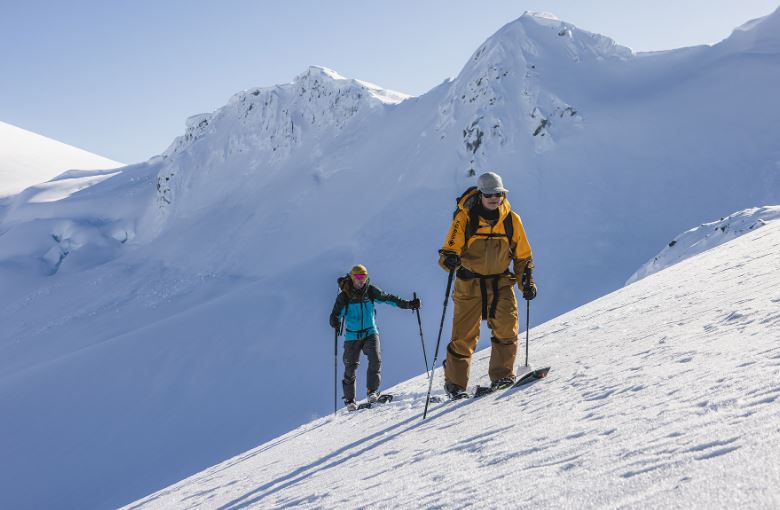
Thunderstorm Artis: Short film for LOGE CampsTo launch LOGE’s Artist Ambassador program, we created a hero film that tells the story of musician Thunderstorm Artis. Using his connection to nature, creativity, and place to reflect the soul of LOGE Camps as more than just a place to stay, but a catalyst for human connection.
Services Creative development
Pre-Production
Production
Post-Production
https://www.youtube.com/watch?v=BlmiBIGAQoM&ab_channel=LOGECamps
The Mission LOGE Camps has always been more than a place to sleep. It’s a place where stories come to life, where creativity is nurtured, and where the outdoors becomes a catalyst for human connection. As they prepared to launch their new Artist Ambassador program, LOGE needed a story that could reflect their values and showcase what makes their camps a meaningful space for artists.
The ask was to introduce the program through the lens of one musician: Thunderstorm Artis. But the real opportunity was to go deeper. To tell a story that wasn’t just about music or lodging, but about how place, purpose, and creativity collide.
The Approach We began by listening. Through early conversations with Thunderstorm, we uncovered the emotional core of the story: his deep, spiritual connection to nature and how it shapes his songwriting. He didn’t just play music. He felt it, through the sound of wind, the rhythm of rivers, and the stillness of trees.
This understanding shaped every creative decision that followed. We chose to film in outdoor locations that were deeply personal to Thunder. The tone was reflective, quiet, and reverent. And the choice to shoot on anamorphic lenses allowed us to elevsate the cinematic quality of both the landscapes and Thunder’s music.
Impact LOGE Camps launched this project and officially announced their ambassador program
Credits Directors:
Latest Industry insights, recents from the Backcountry Marketing Podcast and more @function torem($px){
@return calc($px / 16);
}
// a clamping function used for fluid values
@function fluid($fmin, $fmax, $vmin, $vmax){
$fminr: torem($fmin);
$fmaxr: torem($fmax);
$vminr: torem($vmin);
$vmaxr: torem($vmax);
$v: calc(100 * ($fmaxr - $fminr) / ($vmaxr - $vminr));
$r: calc( (($vminr * $fmaxr) - ($vmaxr * $fminr)) / ($vminr - $vmaxr) );
@return clamp(#{$fminr}rem, #{$v}vw + #{$r}rem, #{$fmaxr}rem);
}
$desk-max: 2600;
$desktop-upper: 1440;
$desktop-lower: 1080;
$tablet: 600;
$mobile: 300;
.cards{
@media (max-width:#{$desktop-lower}px){
.col-12{
margin-bottom:fluid(24,32, $desktop-lower, $desktop-upper);
}
.card{
grid-column:span 6;
&:nth-child(4){
grid-column:span 12;
width:100%;
.w-inline-block{
width:100%;
.card-img-wrap{
aspect-ratio:5/3;
width:calc(50% - var(--gap)/2);
img{
width:100%;
height:100%;
object-fit:cover;
}
}
display:flex;
flex-direction:row;
gap: var(--gap);
align-items:end;
}
}
}
}
@media (max-width:#{$tablet}px){
.card{
grid-column:span 12;
&:nth-child(4){
grid-column:span 12;
width:100%;
.w-inline-block{
width:100%;
.card-img-wrap{
aspect-ratio:1;
width:100%;
img{
width:100%;
height:100%;
object-fit:cover;
}
}
flex-direction:column;
gap:0;
align-items:start;
}
}
}
}
}
.card{
display:flex;
flex-direction:column;
gap:fluid(16, 12, $desktop-upper, $desktop-lower);
@media (max-width:#{$desktop-lower}px){
gap:0;
.dot-brow-gray{
margin-top:fluid(12,16, $desktop-lower, $desktop-upper);
}
}
.h4{
transition: color 300ms cubic-bezier(.3,0,0,1);
@media (max-width:#{$desktop-lower}px){
margin-top:#{torem(4)}px;
}
}
.card-img-wrap{
overflow:hidden;
border-radius:var(--radius);
aspect-ratio: 1;
}
img{
object-fit:cover;
width:100%;
height:100%;
object-fit:cover;
@media (max-width:#{$desktop-lower}px){
aspect-ratio:4/5;
}
will-change:transform;
transition: transform 300ms cubic-bezier(.3,0,0,1)
}
&:hover{
img{
transform: scale(1.1);
}
.dot-brow-gray:before{
background-color:var(--red);
}
.h4{
color:var(--white);
}
}
}


